


Architectural Tiles Melbourne: Designing Refined Architectural Surfaces
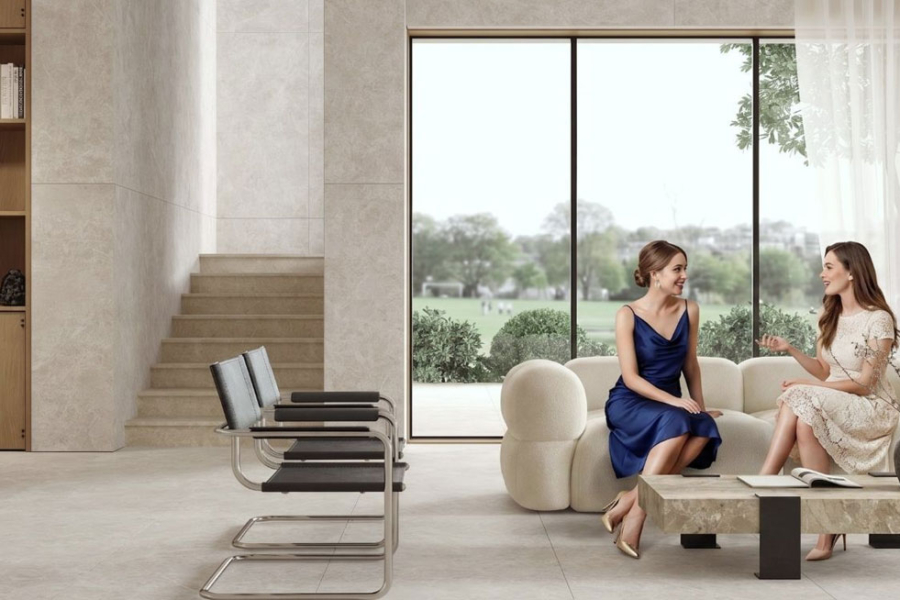
Choosing architectural tiles Melbourne projects require is less about finding an attractive pattern and more about building a coherent material language. Architects, interior designers, builders, developers and design-conscious homeowners can explore Showtile for premium tile surfaces that balance scale, finish, material character, technical performance and the wider architectural concept.
For premium residential and commercial projects, the strongest tile schemes usually begin with the architecture itself. Floors, walls, joinery, stone, timber, lighting and exterior materials should work together so that every surface feels intentional, balanced and appropriate for its application.
What Makes a Tile Suitable for an Architectural Project?
Architectural tiles are selected as part of the building composition rather than as an isolated decorative finish. Material authenticity, proportion, repetition, surface performance and transitions between adjoining finishes all influence whether a tile strengthens or interrupts an architectural concept.
A tile suitable for a considered Melbourne project should typically balance:
- Material quality and visual depth
- Scale and proportion appropriate to the room
- Surface finish suited to lighting and use
- Tonal variation that complements surrounding materials
- Durability for the intended application
- Slip resistance where wet or exposed conditions require additional grip
- Material continuity between connected spaces
- Formats that work with the architectural grid
The objective is not necessarily to make the tile the most noticeable element. In many sophisticated interiors, the strongest tile surfaces create a quiet foundation that allows furniture, joinery, natural light and architectural forms to carry the visual hierarchy.
How Are Architectural Tiles Different From Decorative Tiles?
Decorative tiles often begin with colour, motif or pattern. Architectural tile design begins with the spatial concept.
For example, a feature tile may be appropriate behind a vanity or kitchen splashback, while a large living floor may require a restrained porcelain surface that extends through several connected zones.
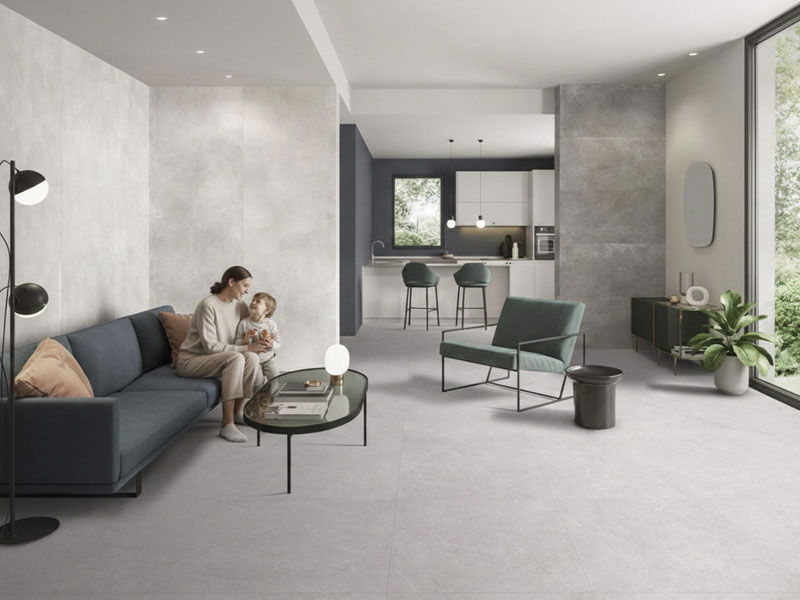
Premium architectural tiles for refined Melbourne spaces
Design teams working across different Australian markets may apply similar specification principles. An earlier guide to architectural tiles Sydney explores that broader architectural approach, while Melbourne projects can place additional emphasis on material layering, indoor-outdoor transitions and warm contemporary palettes.
Why Do Scale and Finish Matter?
Tile size changes how a room is perceived. Large-format tiles create fewer grout lines and can strengthen long sightlines, while smaller modules introduce rhythm, texture and more obvious repetition.
Finish has an equally important effect. Matt and honed surfaces soften reflections, polished finishes increase light movement, and structured finishes add tactile depth. No finish is automatically superior; the correct finish depends on the space, lighting and functional requirements.
Which Materials Work Well in Premium Melbourne Architecture?
Material selection should respond to the architectural language, not simply to current trends. Porcelain tiles, natural stone tiles, slabs and smaller tactile formats each create a different relationship with the surrounding architecture.
When Should Porcelain Tiles Be Specified?
Porcelain tiles work particularly well when a project requires controlled colour, consistent sizing and versatile applications. Porcelain can reproduce stone, concrete, marble and other material references while providing a practical surface for demanding residential and commercial environments.
Porcelain is especially useful for:
- Expansive living floors
- Bathrooms and laundries
- Kitchen floors and walls
- High-use commercial interiors
- Connected interior and exterior schemes
- Minimal spaces where visual consistency matters
For a premium project, porcelain works best when the surface supports the broader palette rather than trying to imitate several unrelated materials within one room.
When Is Natural Stone the Better Choice?
Natural stone tiles introduce genuine variation, texture and movement. Marble, travertine, limestone and other stones can provide depth that develops naturally across individual pieces.
Natural stone can be particularly effective in entrances, bathrooms, fireplace surrounds, kitchen features and areas where material authenticity is central to the design concept. Honed, tumbled, brushed and textured finishes allow stone to move from refined contemporary interiors into more relaxed, tactile spaces.
Natural variation should be treated as part of the design rather than a defect. Sample review and careful layout planning become especially important when stone movement is visually prominent.
Where Do Porcelain Slabs Work Best?
Large-format porcelain slabs are useful when the architecture calls for broad, uninterrupted surfaces. Reduced grout frequency can give bathrooms, kitchens and feature walls a more monolithic character.
Porcelain slabs suit:
- Full-height bathroom walls
- Statement shower zones
- Large kitchen surfaces
- Fireplace surrounds
- Sculptural feature walls
- Premium retail and hospitality interiors
The oversized format should still relate to room proportion. A larger tile is not automatically more architectural; alignment, cutting strategy and adjacent materials determine whether the result feels resolved.
How Should Tiles Be Selected for Different Architectural Spaces?
Every room creates a different performance and visual brief. A bathroom floor, feature wall, open-plan living zone and alfresco terrace should therefore not be specified using appearance alone.
What Works Best for Large Architectural Floors?
Main floors usually establish the base tone for an interior. Stone-look porcelain, restrained concrete references and natural stone can create enough character without competing with furniture or joinery.
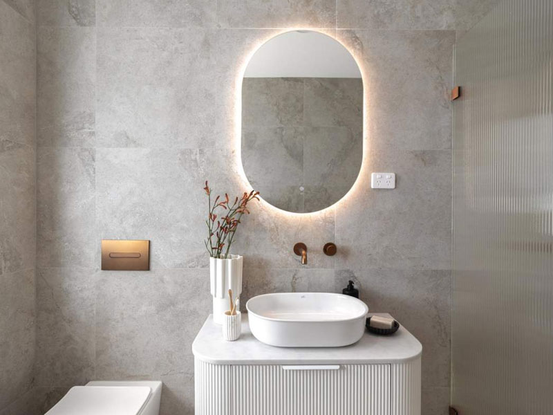
Natural stone adds texture and architectural depth
New Valley is an example of a stone-look porcelain collection that can coordinate floor, wall and external applications. The collection includes internal and external formats, allowing designers to develop visual consistency across connected zones while adjusting the specification for different environments.
When choosing a primary floor, consider:
- Direction of natural light
- Room dimensions
- Furniture layout
- Grout colour
- Tile orientation
- Relationship with timber or cabinetry
- Transitions into adjoining spaces
How Should Architectural Walls Be Treated?
Wall tiles can either disappear into the broader material composition or create deliberate contrast.
Full-height stone-look porcelain can make a bathroom feel calm and continuous. Smaller brick formats can introduce linear rhythm. Textured natural stone can create a stronger focal point in an entrance, fireplace zone or hospitality interior.
A dedicated outdoor wall tiles design strategy becomes more relevant when façades, courtyard walls or landscaped areas need surface texture, whereas interior architectural walls generally require closer coordination with lighting, joinery and room scale.
How Should Bathroom Tiles Be Coordinated?
A refined bathroom usually benefits from a clear hierarchy rather than several competing tiles.
One effective composition is:
- Establish one restrained primary floor tile.
- Continue the same or a closely related material onto key walls.
- Introduce texture at one controlled location.
- Coordinate grout with the dominant surface.
- Allow tapware, vanity finishes and lighting to provide secondary contrast.
The resulting bathroom reads as one architectural space rather than a collection of individual finishes.
How Can Melbourne Projects Create Indoor-Outdoor Continuity?
Indoor-outdoor continuity does not require identical surfaces everywhere. The better approach is to maintain similar tone, scale and material character while choosing the correct technical finish for each location.
An interior surface may use a refined matt finish, while an exposed terrace requires a more textured external surface. Visual continuity remains intact because colour and pattern remain related even though performance changes.
Which Collections Support Connected Interior and Exterior Spaces?
Twilight provides a useful example. The stone-look porcelain collection includes matt interior surfaces and external paver options, supporting transitions from living spaces toward outdoor zones while maintaining a related visual language.
Another approach is to use an intentionally related but not identical exterior material. An indoor limestone-look surface, for example, may connect naturally with a textured paver or genuine stone outside because both materials share similar undertones.
What Should Be Checked for Outdoor Applications?
External tile specification should consider more than appearance.
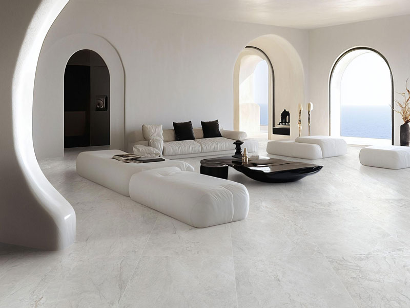
Large-format tiles create clean, continuous surfaces
Check:
- Slip resistance
- Exposure to rain
- Surface texture
- Pool proximity
- Drainage
- Tile thickness
- Installation substrate
- Movement joints
- Maintenance expectations
Showtile’s outdoor category includes porcelain, pavers, cladding and coping solutions designed around the relationship between the architecture and surrounding landscape.
How Do Tile Format, Texture and Colour Shape Architecture?
Tile design is strongly influenced by three variables: format, texture and colour. Changing any one of these elements can significantly alter the perceived scale and atmosphere of a room.
How Does Tile Format Affect Spatial Proportion?
Large formats can visually expand a surface because grout lines become less frequent. Small formats create stronger rhythm and can help define a specific architectural zone.
A useful rule is to match the format with the purpose:
| Architectural Application | Format Direction | Design Effect |
| Open-plan living | Large format | Calm, continuous surface |
| Full-height bathroom | Medium to large format | Reduced visual interruption |
| Feature wall | Brick or textured format | Rhythm and tactility |
| Splashback | Small or elongated format | Controlled detail |
| Commercial floor | Medium to large porcelain | Consistency and durability |
| Alfresco area | External tile or paver | Strong interior-exterior relationship |
The table is a design framework rather than a universal specification. Final tile dimensions should always be coordinated with room geometry, installation conditions and the particular product.
When Should Texture Become a Feature?
Texture works best when the architectural concept gives the textured surface a clear role.
Square Tumbled Tiles can introduce natural stone character where an interior requires softer edges and a more tactile material expression. Tumbled stone is particularly effective beside smooth plaster, clean cabinetry or restrained porcelain because the contrast feels deliberate rather than busy.
In more linear interiors, elongated or brick-shaped tiles can create a different type of texture through repetition and shadow rather than irregular stone movement.
Which Colours Suit Refined Contemporary Interiors?
Premium architecture does not require an entirely neutral palette, but restrained base tones are easier to coordinate across a whole project.
Useful architectural colours include:
- Warm white
- Limestone
- Sand
- Travertine
- Greige
- Taupe
- Soft grey
- Clay
- Muted green
- Charcoal
The strongest palette normally repeats undertones rather than exact colours. Warm stone flooring, walnut cabinetry and brushed metal can feel cohesive because each material occupies a different visual role while sharing compatible warmth.
How Can Architects Build a Cohesive Material Palette?
A cohesive tile palette begins with one dominant architectural surface and develops outward. Adding a new tile for every room often fragments the project.
A more controlled method is to establish a primary floor or stone reference, then vary format, finish and texture while maintaining related tones.
Should Every Room Use the Same Tile?
No. Material continuity does not mean repetition without variation.
A living floor may use large stone-look porcelain, a bathroom may use a related wall format, and a powder room may introduce a smaller tactile surface. The palette remains cohesive because colour, texture and material references remain connected.
Homeowners considering designer tiles Melbourne projects often gain a stronger result by reducing the number of unrelated finishes and investing more attention in how a smaller set of surfaces works together.
How Should Tiles Relate to Timber, Joinery and Stone?
Tile selection should take place beside other finish samples whenever possible.
Compare the tile against:
- Timber flooring or veneer
- Cabinetry colours
- Benchtops
- Metal finishes
- Paint
- Render
- Natural stone
- Exterior materials
A beige tile, for example, can contain yellow, grey, pink or earthy undertones. Those undertones become much more visible when the tile sits beside timber or stone.
What Should Be Checked Before Architectural Tiles Are Specified?
Technical decisions should be resolved early enough to influence tile selection rather than being addressed after the visual palette has been approved.
Architects, builders and homeowners should confirm:
- Wall or floor suitability
- Internal or external application
- Wet-area requirements
- Slip performance
- Thickness
- Nominal dimensions
- Substrate preparation
- Layout
- Grout joint
- Movement requirements
- Cleaning and maintenance
- Quantity and replacement allowance
Large formats deserve particular attention because substrate flatness, handling, cutting and alignment become increasingly important as tile dimensions increase.
Which Showtile Collections Are Worth Exploring for Architectural Projects?
Rather than treating tiles as isolated products, explore Showtile’s complete collection by material, application, surface and design. The collection includes porcelain, natural stone, large-format slabs, stone-look surfaces, concrete-look finishes, feature formats, external tiles and pavers.
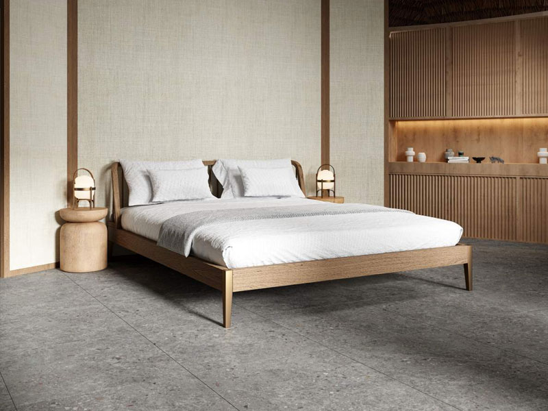
Showtile surfaces for cohesive residential and commercial design
Several product directions can support different architectural concepts:
- New Valley for restrained stone-look continuity
- Twilight for coordinated indoor and outdoor schemes
- Pure Stone for larger stone-inspired surfaces
- Valencia for soft contemporary stone references
- Yosemite for understated matt stone-look interiors
- Porcelain slabs for broad feature surfaces
For example, Valencia combines stone-inspired movement with multiple surface options and 600 × 600 mm and 600 × 1200 mm formats, making the collection suitable for projects requiring a refined but controlled material language.
Why Consider Showtile for Premium Architectural Surfaces?
A specialist designer tiles company should help a project move beyond choosing individual colours and toward coordinating material, scale, finish and application.
Showtile curates porcelain, natural stone, large-format surfaces and design-led tile collections for residential, commercial and architectural projects. The range allows architects, interior designers, builders and homeowners to compare different surface languages while keeping the broader material composition in focus.
For Melbourne projects, the most useful approach is to begin with the architectural brief, identify the primary surfaces and then shortlist tiles that coordinate with joinery, stone, timber, exterior materials and natural light.
Samples should be reviewed together rather than individually. Seeing several materials side by side often reveals undertones, scale differences and texture relationships that are difficult to judge from separate product images.
Contact Showtile
📍 Showroom: 65 Canterbury Road, Bankstown NSW 2200, Australia
📞 Phone: +61 2 9709 5836
✉️ Email: sales@showtile.com.au
🌐 Website: https://showtile.com.au/



