


Designer Tiles Melbourne: How to Choose Premium Tiles for Refined Spaces
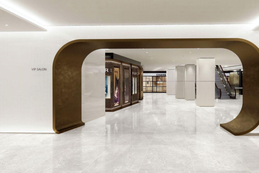
Choosing designer tiles Melbourne projects can depend on requires more than following a colour trend. The strongest interiors combine the right material, format, texture and finish with the architecture of the space. Showtile offers curated premium tile collections for homeowners, architects, interior designers and builders seeking refined surfaces for bathrooms, kitchens, living areas and commercial projects.
What Should Melbourne Buyers Look for in Designer Tiles?
A well-selected designer tile balances material character, proportion, surface finish and suitability for the intended application. Colour is important, but colour should be considered alongside scale, texture, grout, natural light and surrounding finishes.
How Does Tile Material Affect the Final Interior?
Different materials create different levels of movement, texture and visual depth.
Porcelain tiles are widely suited to contemporary residential and commercial applications because the material is available in many formats and surface directions. Porcelain can interpret marble, travertine, limestone, concrete, terrazzo and timber while supporting a consistent architectural palette.
Ceramic tiles are particularly useful for walls, splashbacks and decorative areas where colour, glaze or handmade character is part of the design.
Natural stone tiles offer authentic tonal and textural variation. Stone should be selected with its maintenance, sealing and individual characteristics in mind rather than treated as an identical substitute for porcelain.
Why Do Tile Size and Proportion Matter?
Tile format changes the perceived scale of a room.
A large-format tile can reduce visual interruption across broad floors or full-height walls, while smaller formats create more rhythm through repeated joints. Neither approach is automatically better. The correct proportion depends on wall dimensions, room geometry, joinery and the desired level of visual detail.
Before confirming a size, project teams should consider where cuts will fall around doors, vanities, niches, cabinetry and corners.
How Should Tile Finish and Texture Be Evaluated?
Finish affects both appearance and the way light moves across a surface.
Matt tiles tend to create a quieter, more restrained effect. Gloss surfaces increase reflection and can bring more movement to smaller feature areas. Textured finishes create shadow and tactile depth.
For flooring and wet areas, the selected surface should also be checked for its intended technical application rather than chosen only for appearance.
Which Designer Tile Styles Work Well in Melbourne Interiors?
Premium interiors rarely depend on one trend. Stronger spaces use material direction, tone and texture to create a coherent relationship between architecture and furnishings.
When Are Stone-Look Tiles a Strong Choice?
Stone-look tiles work well when a project needs the visual depth of limestone, marble or travertine without making natural stone the only material option.
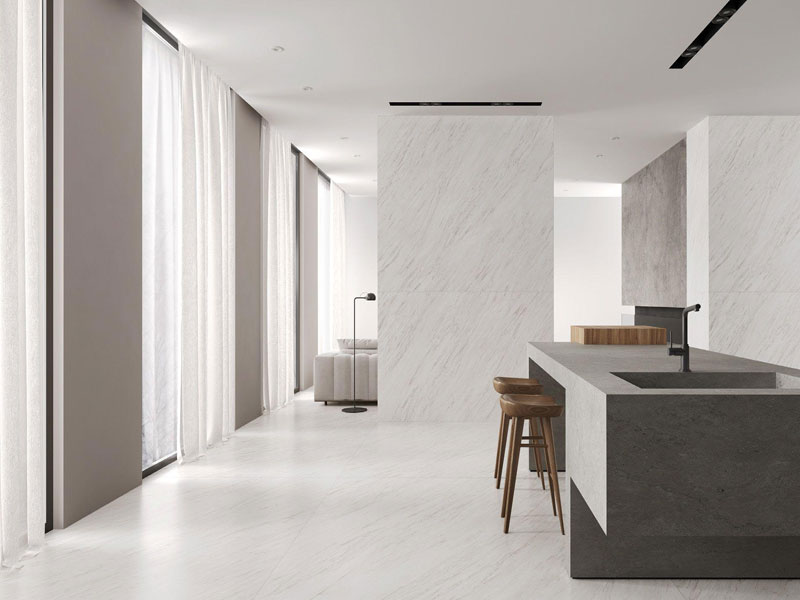
Premium designer tiles for refined Melbourne interiors
Warm travertine references can complement timber, cream joinery and brushed metals. Limestone-inspired surfaces create a quieter neutral foundation, while marble-look porcelain can introduce more visible veining to bathrooms, entrances and statement walls.
The key is choosing a stone reference that relates to the rest of the palette rather than selecting veining purely for visual impact.
Why Do Concrete-Look Tiles Suit Contemporary Spaces?
Concrete-look tiles can form a restrained architectural base for contemporary houses, apartments and commercial interiors.
Soft grey, greige and mineral surfaces work particularly well beside timber, black metal, natural render and simple cabinetry. A concrete-inspired surface can feel warmer and more residential when balanced with tactile furnishings and natural materials.
Where Can Terrazzo-Look Tiles Add Character?
Terrazzo-look tiles introduce controlled pattern through aggregate-like surface movement.
They can work across:
- Bathrooms
- Powder rooms
- Kitchen floors
- Entrances
- Hospitality interiors
- Selected feature areas
When terrazzo already contains several colours, surrounding materials should generally remain quieter. This allows the surface variation to provide interest without competing with cabinetry, stone benchtops or feature lighting.
How Can Timber-Look Tiles Introduce Warmth?
Timber-look tiles can add visual warmth where a timber reference suits the interior direction.
The grain introduces its own movement, so nearby surfaces often benefit from restraint. Pairing timber-inspired porcelain with a quiet stone-look wall or neutral joinery can create a clearer hierarchy than combining multiple expressive patterns.
How Should Designer Tiles Be Selected for Different Areas?
Each area places different demands on the material palette. A successful project should therefore establish a consistent overall design language while adjusting format and finish to suit each application.
What Works Best for a Designer Bathroom?
Bathroom design should begin with a clear relationship between floor, wall, vanity and fixtures.
For the main floor, the washroom floor tiles design should consider surface suitability, grout frequency, drainage layout and visual continuity before decorative detail is introduced.
A bathroom may combine:
- Stone-look porcelain flooring
- Full-height neutral wall tiles
- A textured vanity backdrop
- A controlled feature niche
- Timber or stone cabinetry elements
For vertical surfaces, Showtile’s guide to bathroom wall design tiles provides further ideas for coordinating wall formats, finishes and feature areas without allowing every surface to compete.
What Tile Features Matter in a Designer Kitchen?
Kitchen tiles need to work with cabinetry, benchtops, appliances and lighting.
A splashback can carry stronger colour or texture because the tiled area is usually more concentrated. Floors generally play a broader architectural role and should connect visually with adjoining living or dining spaces.
Glazed subway tiles can add reflected light to a splashback, while stone-look or large-format porcelain can create a quieter base beneath detailed joinery.
How Can Living Areas Use Tiles Without Feeling Cold?
Living areas feel more inviting when tiled floors are balanced with warmer materials and softer layers.
A restrained tiles on floor design can combine large-format porcelain with timber joinery, rugs, fabric furniture and textured walls so that the floor supports the room rather than dominating the visual experience.
Warm stone colours, subtle variation and matt finishes are particularly effective when the objective is calm continuity across open-plan spaces.
What Should Commercial Interiors Prioritise?
Commercial tile selection should respond to both design intent and the demands of the particular project.
Architects and designers should consider:
- Traffic conditions
- Surface suitability
- Cleaning requirements
- Format
- Material transitions
- Lighting
- Repeatability across larger areas
- Coordination with joinery and signage
Restaurants, boutiques, wellness spaces and premium offices can use tiles to reinforce identity without relying on excessive pattern.
Which Tile Formats Create the Strongest Designer Effect?
Format influences rhythm, scale and the number of visible grout joints. Instead of asking which tile size is most luxurious, designers should ask which format best supports the architecture.
When Should Porcelain Slabs and Large Formats Be Used?
Large Format / Porcelain Slabs are especially effective where the design calls for broad, continuous surfaces.
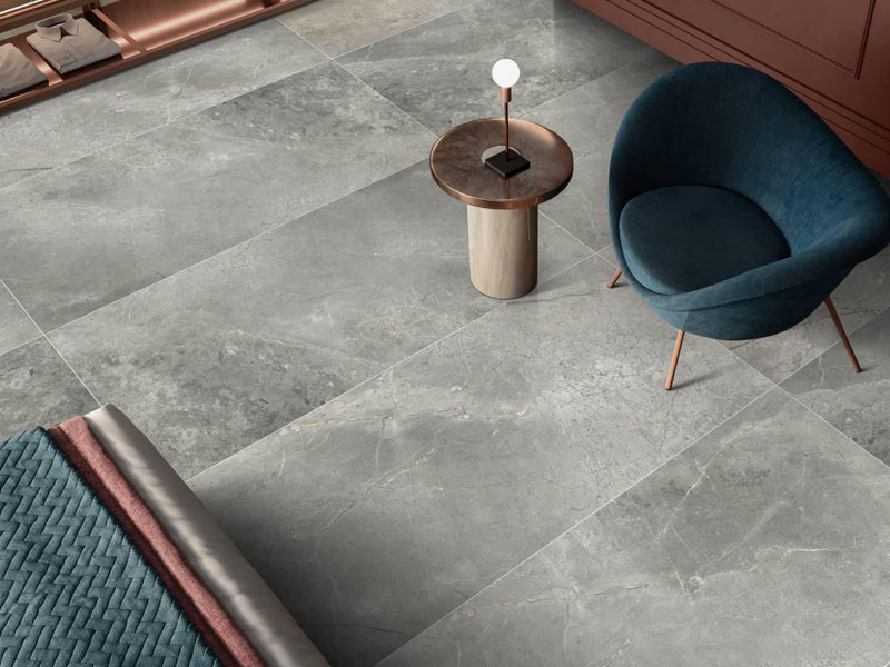
Large-format tiles create seamless, modern spaces
Applications can include:
- Full-height bathroom walls
- Expansive floors
- Feature walls
- Large commercial interiors
- Stone-inspired architectural surfaces
Reduced visual interruption allows veining or tonal movement to read across a larger area. Showtile currently includes large-format porcelain slabs among its premium design collections.
When Are Smaller Formats More Appropriate?
Smaller formats provide more rhythm and detail.
Subway tiles can work across splashbacks, vanity walls and selected decorative surfaces. Handmade-inspired pieces, Kit Kat formats, geometric tiles and other smaller designs can also provide a tactile counterpoint to larger architectural surfaces.
Small tiles do not need to cover an entire room to make an impact. A concentrated feature area can often create a stronger result.
How Can Multiple Tile Formats Be Combined?
A useful principle is to vary scale without varying every other design element at the same time.
For example:
- Large stone-look floor + small tonal wall tile
- Large neutral wall + detailed vanity splashback
- Broad porcelain surface + restrained textured niche
Repeating colour temperature across different formats helps keep the palette connected.
How Can Colour and Texture Shape a Refined Interior?
Colour establishes atmosphere, while texture determines how the surface responds to light. Both elements should be selected in relation to cabinetry, stone, metal finishes, paint and furniture.
Should Neutral Designer Tiles Always Be the Default?
Neutral does not need to mean plain white or grey.
A premium neutral palette may include:
- Warm limestone
- Sand
- Travertine beige
- Soft greige
- Cream
- Muted clay
- Pale mineral tones
These colours can form a durable architectural foundation while allowing furniture and artwork to change over time.
Colour can still be introduced selectively. Muted green, earthy terracotta and deeper blue-grey tiles can create strong focal areas when the remaining materials stay controlled.
How Should Feature Tiles Be Balanced?
A feature surface works best when the surrounding materials establish a visual hierarchy.
One practical sequence is:
- Choose the dominant architectural surface.
- Select a supporting material with a related undertone.
- Add one controlled feature texture or colour.
- Repeat a material or tone elsewhere in the room.
- Keep grout compatible with the intended visual effect.
A room where every tile attempts to become the focal point can quickly lose clarity.
Can Premium Tiles Work in Both Heritage and Contemporary Homes?
Yes, but the material language should respond to the architecture.
Heritage-influenced interiors may suit handmade surfaces, terracotta references, natural stone and smaller formats with visible character.
Contemporary architecture often benefits from large formats, restrained grout lines, stone-look porcelain, concrete-inspired surfaces and controlled tonal variation.
The objective is not to reproduce an architectural period literally. The selected tiles should complement the proportion, detailing and material character of the building.
How Do Architects and Designers Specify Premium Tiles?
Professional specification goes beyond choosing colour from an image. Tile decisions should be coordinated with technical information, material samples and installation conditions.
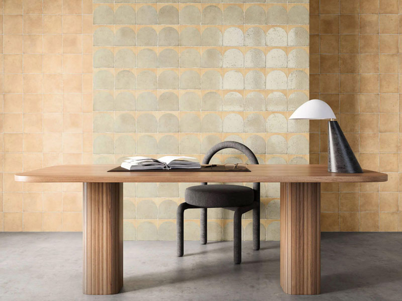
Feature wall tiles add texture and character to refined interiors
What Should Be Checked Before Final Specification?
Project teams should confirm:
- Tile dimensions
- Thickness
- Finish
- Surface variation
- Edge profile
- Intended application
- Required slip classification where relevant
- Batch availability
- Layout
- Cutting requirements
- Grout
- Maintenance
- Installation considerations
Working with an experienced designer tiles company can also make it easier to compare different formats and finishes as part of one architectural palette rather than selecting products independently.
Why Should Tile Samples Be Viewed With Other Materials?
A tile sample should ideally be assessed next to:
- Cabinetry
- Benchtop stone
- Timber
- Paint
- Metal finishes
- Upholstery where relevant
A warm beige tile may appear neutral by itself but comparatively pink, yellow or grey beside another material.
Why Is Lighting Important?
Natural and artificial light can change the apparent colour, depth and sheen of a tile.
Matt finishes tend to diffuse reflections, while polished and glazed surfaces reveal more highlights. Texture also becomes stronger under directional lighting because raised areas create shadow.
Viewing samples in both daytime and evening conditions provides a more useful representation than relying solely on product images.
What Is the Difference Between Designer and Standard Tile Selection?
The difference is often found in the selection process rather than a label printed on the product.
| Factor | Designer-Led Selection | General Selection |
| Starting point | Architecture and material palette | Individual tile |
| Format | Selected around proportion | Common size preference |
| Surface | Texture and light considered | Colour often leads |
| Application | Project-specific | General use |
| Coordination | Joinery, stone and fixtures considered | Tile may be chosen independently |
| Layout | Planned early | Often resolved later |
A premium tile does not automatically create a premium interior. The overall result depends on specification, proportion, layout and the way materials relate to one another.
Are Premium Designer Tiles Worth Choosing for a High-End Project?
Premium tile selection is most valuable where surfaces carry significant visual or architectural weight.
Where Does Tile Selection Have the Greatest Impact?
Priority areas often include:
- Main bathrooms
- Kitchens
- Entrances
- Large open-plan floors
- Feature walls
- Hospitality areas
- Retail interiors
- Architect-designed residential spaces
These areas are frequently visible from multiple viewpoints, making scale and material continuity especially important.
When Is a Simpler Surface the Better Decision?
Not every room needs a statement tile.
Utility spaces, secondary rooms and areas dominated by cabinetry may benefit from a simpler porcelain surface. The purpose of premium design is not maximum decoration; it is making the right material decision for each part of the project.
How Can Melbourne Projects Build a Cohesive Tile Palette?
A structured selection process reduces the risk of choosing several attractive products that do not work together.
Step 1: Start With the Architecture
Identify the building style, room proportions, natural light and major sightlines.
Step 2: Choose the Dominant Surface
This may be a stone-look floor, large-format porcelain or another restrained architectural material.
Step 3: Add One Supporting Texture
Introduce a smaller tile, handmade surface or feature colour without competing with the dominant material.
Step 4: Test the Full Palette
Place tile samples beside joinery, paint, stone, timber and metal finishes.
Step 5: Confirm Technical Suitability
Check application, dimensions, finish, quantity and installation requirements before final ordering.
Which Showtile Collections Suit Design-Led Projects?
Showtile offers a broad selection of architectural surfaces for homeowners, interior designers, architects and builders developing residential and commercial material palettes. The current tile collection includes porcelain slabs, stone-look, concrete-look, terrazzo-look, timber-look, natural stone, handmade, subway, patterned and other design categories.
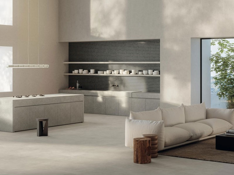
Showtile collections for design-led residential projects
Rather than selecting every surface independently, project teams can compare related colours, formats and textures across the collection.
Useful starting points include:
- Stone Look Tiles for marble, limestone and travertine-inspired palettes
- Subway Tiles for kitchens, bathrooms and feature walls
- Feature Wall Tiles for controlled texture and architectural focal points
- Indoor Tiles for coordinated interior surfaces
- Large Format / Porcelain Slabs for expansive, visually continuous applications
The most successful designer tile scheme is rarely built around the most dramatic individual product. A refined result comes from selecting materials that work together across scale, light, texture, architecture and everyday use.
Contact Showtile
📍 Showroom: 65 Canterbury Road, Bankstown NSW 2200, Australia
📞 Phone: +61 2 9709 5836
✉️ Email: sales@showtile.com.au
🌐 Website: https://showtile.com.au/



