


Blue Bathroom Tiles Design: Creating a Calm and Stylish Space
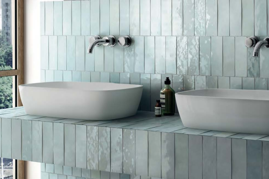
A well-planned blue bathroom tiles design starts with choosing how much visual weight the colour should carry within the room. Tone, placement, lighting and surrounding finishes all influence whether blue feels soft, dramatic or architectural. Showtile helps homeowners, designers and builders create balanced bathroom palettes where colour works naturally with the wider material scheme.
Which Shade of Blue Works Best in a Bathroom?
The best blue depends on bathroom size, natural light and the atmosphere the interior needs to create. Pale shades generally produce a softer and more open result, while navy and deeper blue tones introduce stronger contrast and visual depth.
When Do Pale Blue Tiles Work Best?
Pale blue works particularly well where the bathroom needs colour without heavy visual weight.
Useful applications include:
- Compact ensuites
- Bright bathrooms
- Vanity splashbacks
- Shower walls
- Bathrooms with white sanitaryware
Soft sky blue, powder blue and muted aqua can create a gentle colour field while allowing mirrors, joinery and fixtures to remain visually prominent.
A smaller glossy format can also make pale blue more expressive because reflected light changes across each tile face.
When Does Navy or Deep Blue Work Better?
Deeper blue works well where the bathroom needs a more architectural or dramatic surface.
Navy can be concentrated behind:
- A vanity
- A freestanding bath
- A shower
- A recessed wall
- A full-height feature plane
Deep blue does not automatically make a bathroom feel smaller.
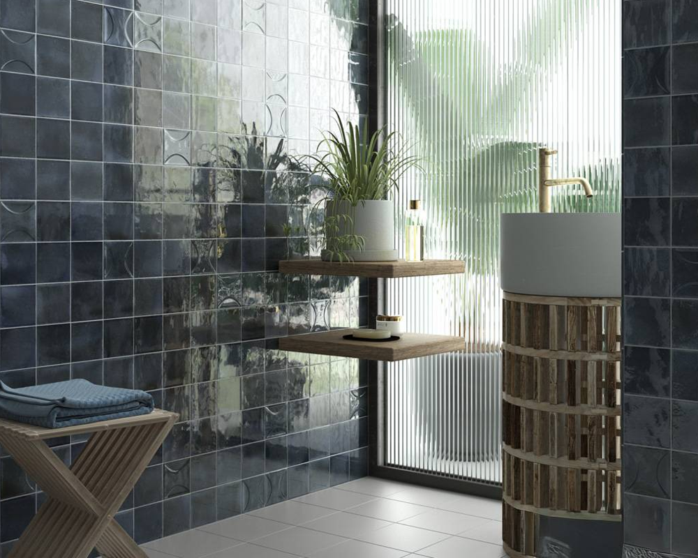
Deep blue tiles add depth and character
The final effect depends on the amount of dark surface, surrounding neutrals, available light and whether the darker material is placed as one controlled plane or scattered across several walls.
Can Blue-Grey Be Easier to Coordinate?
Yes.
Blue-grey sits between stronger blue and neutral stone, making the colour easier to integrate with grey veining, timber, charcoal and brushed metal.
This makes blue-grey especially useful in architectural bathrooms where the design needs colour without feeling highly decorative.
How Much Blue Should a Bathroom Use?
A blue bathroom does not need to use blue across every surface. A stronger design usually decides how much visual weight blue should carry before selecting individual tiles.
Can Blue Cover Every Bathroom Wall?
Yes, particularly when the blue tone is restrained and the tile format is visually quiet.
An all-over blue scheme works best when:
- Grout contrast remains controlled
- Tile size is consistent
- Fixtures provide clear visual breaks
- The floor supports rather than competes with the walls
The result should feel enveloping rather than fragmented.
When Is One Blue Feature Wall Enough?
A stronger or more saturated blue may need only one main surface.
Good locations include:
- Vanity wall
- Shower end wall
- Bath backdrop
- Wall behind an open shower
One concentrated colour plane can give the bathroom identity while allowing surrounding surfaces to remain calm.
Can Blue Be Used Only as a Small Accent?
Yes.
Blue may appear in:
- Shower niche
- Vanity splashback
- Mosaic panel
- Small shower floor
- Recessed shelf
This approach is useful when the wider bathroom palette is primarily stone, white or warm neutral.
Where Should Blue Tiles Be Placed in the Bathroom?
Blue placement should follow the architecture of the room rather than being distributed evenly. A clearly defined colour zone is easier to read than several unrelated blue surfaces.
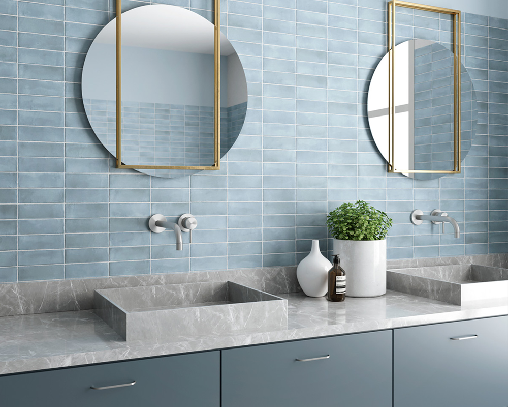
Blue tiles bring calm colour to the bathroom
Do Blue Tiles Work Better on Walls or Floors?
Both can work.
Blue on walls places colour closer to eye level and generally creates stronger visual impact. Blue on the floor acts as a base and can make lighter walls feel more open.
For larger floor or wall fields, a quieter material direction from the stone-look tile collection can help balance a stronger blue feature without introducing another competing decorative language.
Can a Blue Shower Become the Main Feature?
Yes.
A shower enclosure already forms a clear architectural zone, making the area suitable for stronger colour.
Blue can cover:
- Every shower wall
- One shower wall
- A niche
- A lower wall zone
The colour should still relate to the rest of the bathroom through grout, joinery, stone or fixture finishes.
Should the Vanity Area Repeat the Blue?
A limited repetition can create continuity.
For example, a blue shower wall can be echoed through a small vanity splashback rather than repeating the same colour across another full wall.
This creates connection without making the palette feel overly coordinated.
How Does Light Change the Appearance of Blue Tiles?
Blue is highly responsive to light, so the same tile can appear cooler, brighter or deeper throughout the day. Finish, surface irregularity and light source all affect how the colour is perceived.
Why Do Gloss Blue Tiles Look Different Throughout the Day?
Gloss surfaces reflect surrounding daylight, mirrors, fixtures and artificial lighting.
A glossy blue tile can therefore shift between lighter highlights and deeper shadow areas as the viewing angle changes.
This effect is especially noticeable with irregular or handmade-look surfaces, where slight variations across individual tile faces add more visual movement.
When Does Matt Blue Feel Calmer?
Matt finishes reduce reflection and can make saturated blue feel more grounded.
A matt blue surface can work well on:
- Larger wall areas
- Floors
- Powder rooms
- Contemporary ensuites
The reduced shine allows colour depth to become more important than reflection.
Can Warm Lighting Change Cool Blue?
Yes.
Warm artificial light can soften a cool blue tone, while cooler white lighting can reinforce its crisp or grey undertone.
Physical tile samples should therefore be reviewed under both daylight and evening bathroom lighting before a final colour decision is made.
Which Colours Pair Best With Blue Bathroom Tiles?
Blue works best when surrounding materials control whether the bathroom feels cool, warm, graphic or natural. The supporting palette is just as important as the blue tile itself.
Why Do Warm Whites Work With Blue?
Warm white creates contrast without making the room feel clinical.
A combination such as:
blue + warm white + timber
can keep the bathroom bright while introducing enough warmth to balance the cooler colour family.
This is particularly useful with saturated blue.
Can Beige or Stone Soften Blue?
Yes.
Beige, limestone-inspired and warm stone surfaces introduce earthier undertones and prevent blue from feeling isolated from the wider interior palette.
This pairing works particularly well in premium bathrooms that need colour without becoming overtly coastal or thematic.
Does Grey Work With Blue Tiles?
Yes, especially when blue itself contains a grey undertone.
Blue-grey can sit naturally beside:
- Soft concrete tones
- Charcoal
- Grey stone
- Brushed nickel
- Dark joinery
The combination creates a more architectural interpretation of blue.
When Should Timber Be Added?
Timber is useful when the bathroom needs more warmth and tactile contrast.
A timber vanity or shelving can offset glossy or saturated blue surfaces while also connecting the bathroom with adjoining living spaces.
This same principle of coordinating colour with quieter architectural materials also appears in black and white bathroom tiles design, where the strongest result comes from controlling visual weight rather than relying on colour contrast alone.
How Can Blue Tile Shape Change the Bathroom Style?
Tile shape determines whether blue reads as a broad colour field or as a more detailed decorative surface. The stronger the tile rhythm, the more visually active the colour becomes.
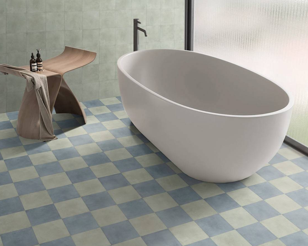
Thoughtful blue tones create a cohesive bathroom look
When Do Subway Tiles Work Best?
Blue subway tiles suit bathrooms where colour needs to be combined with a clear modular pattern.
Possible layouts include:
- Horizontal stack
- Vertical stack
- Offset brick layout
- Herringbone feature
The subway tile collection can support this direction where the bathroom needs stronger linework without relying on complex pattern.
When Do Kit Kat Tiles Feel More Contemporary?
Narrow vertical tiles create a finer surface rhythm.
Kit Kat-style mosaics work particularly well on:
- Vanity splashbacks
- Shower niches
- Feature walls
- Curved surfaces
The slim format can make a deep blue feel more textural because grout lines and reflected light break the colour into smaller sections.
Can Fishscale Tiles Make Blue More Decorative?
Yes.
Fishscale shapes naturally introduce more pattern, especially when blue is already saturated.
This works best when the surrounding surfaces are quieter. A decorative blue fishscale feature can become the main visual detail while the rest of the bathroom uses simpler geometry.
How Should Grout Work With Blue Tiles?
Grout determines whether blue reads as one continuous material field or as a visible grid. The decision should support the intended level of visual activity.
Should Blue Tiles Use Matching Grout?
A similar grout tone reduces contrast between individual tiles.
This can help:
- Deep blue appear more continuous
- Small tiles feel less busy
- Large blue wall areas remain calm
Matching grout is particularly useful where colour is already strong enough to carry the design.
When Should White Grout Be Used?
Light grout creates a more graphic result.
White or pale grout can emphasize:
- Subway formats
- Kit Kat mosaics
- Geometric layouts
The tile layout becomes more visible, so the result should be coordinated with other patterned elements in the room.
Can Dark Grout Work With Navy Tiles?
Yes.
Dark grout can visually merge with navy or deep blue tiles and reduce the prominence of the grid.
The final grout selection should still follow the product and installation requirements for the specific application.
Can Blue Pattern Be Used Without Making the Bathroom Busy?
Pattern works best when one surface carries the decorative role and the surrounding palette remains restrained.
Should Pattern Cover the Whole Bathroom?
Usually not necessary.
A blue pattern across every surface can compete with mirrors, fixtures, joinery and lighting.
More controlled locations include:
- Powder-room floor
- Shower floor
- Vanity wall
- Bath feature
- Small decorative wall
The mosaic tile collection can provide a smaller-scale change while allowing larger wall surfaces to remain visually quiet.
Can Solid Blue and Patterned Blue Be Combined?
Yes, provided the two surfaces share a related tonal family.
A solid blue can form the main field while a patterned or smaller-format blue appears only in one zone.
The pattern should lead or support, not compete at equal strength.
How Can Blue Tiles Feel Premium Rather Than Themed?
Premium blue bathrooms treat colour as an architectural material rather than a decorative theme. Blue should define a surface, volume or zone instead of being reinforced through literal nautical accessories or repeated motifs.
Why Should Blue Be Treated as a Material Surface?
A full-height blue shower wall or structured vanity backdrop feels more architectural than scattered blue accessories.
The colour becomes part of the room’s geometry.
This makes blue easier to integrate with:
- Natural stone
- Timber
- Metal
- Neutral porcelain
- Plaster-like surfaces
How Can Strong Blue Avoid Feeling Coastal?
Avoid relying exclusively on:
- Aqua tones
- White-and-blue stripes
- Nautical accessories
- Shell motifs
- Ocean imagery
Instead, pair blue with cleaner architecture and premium materials.
Can Simplicity Make Blue Feel More Sophisticated?
Yes.
When colour already provides visual interest, the remainder of the tile scheme can be more restrained.
The same principle is central to simple bathroom tiles design: fewer unnecessary surface changes allow one material decision to carry more visual impact.
How Do Different Blue Bathroom Directions Compare?
| Bathroom Direction | Blue Approach | Visual Effect | Main Consideration |
| Light contemporary | Sky or powder blue | Fresh and open | Keep undertones soft |
| Architectural bathroom | Blue-grey | Calm and structured | Coordinate with stone |
| Luxury ensuite | Deep navy feature | Strong and sophisticated | Lighting |
| Textural bathroom | Gloss irregular blue | Rich surface variation | Reflection |
| Decorative bathroom | Blue mosaic or fishscale | Expressive and detailed | Pattern density |
| Compact ensuite | Blue accent with neutral base | Controlled colour | Placement |
The strongest direction depends on the amount of colour the bathroom can support and how blue interacts with the surrounding architecture.
What Can Make a Blue Bathroom Feel Unbalanced?
Blue bathrooms become difficult to coordinate when too many unrelated blue shades, patterns or cool materials compete at the same strength.
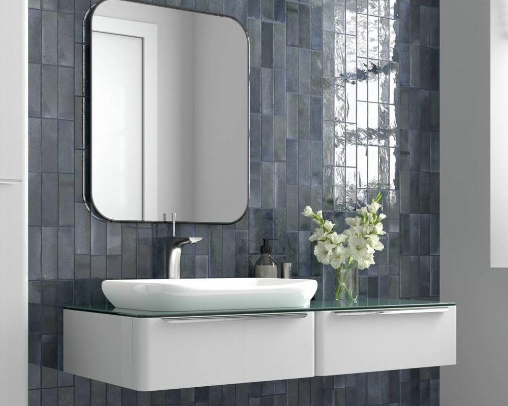
Showtile brings thoughtful tile design to contemporary bathroom spaces
Can Too Many Shades of Blue Compete?
Yes.
Sky blue, navy and turquoise can work together only when there is a clear tonal hierarchy.
Adding several unrelated shades without a dominant colour can make the palette feel accidental.
Can Cool Blue and Cool White Feel Too Clinical?
Yes.
Warm materials can soften the combination.
Useful additions include:
- Timber
- Off-white
- Warm stone
- Brushed brass
- Warm lighting
Can Strong Blue Pattern Overpower a Small Room?
Yes, particularly when the pattern also uses contrasting grout.
A smaller feature area can preserve the pattern while leaving enough quiet surface around the room.
Can Blue Tiles Clash With Fixture Finishes?
Yes.
Chrome tends to reinforce a cooler palette, black creates stronger graphic contrast and warmer metal finishes can soften blue.
Fixture selection should therefore be considered at the same time as tile colour.
A Practical Formula for Building a Blue Bathroom Palette
A clear sequence helps prevent colour from becoming disconnected from the wider interior:
- Choose the blue undertone.
Decide whether the scheme should move toward sky, grey, navy, aqua or another direction. - Set the visual weight of blue.
Determine whether blue is the dominant material or a controlled accent. - Choose one primary blue surface.
Establish the main feature before adding secondary colour. - Select the neutral supporting material.
Use white, stone, grey or timber to balance the palette. - Choose tile shape and scale.
Decide whether the blue should read as a broad field or detailed pattern. - Coordinate grout.
Use grout to either soften or emphasize the tile grid. - Add vanity and metal finishes.
Ensure joinery and tapware support the selected colour temperature. - Review samples under real lighting.
Check blue surfaces in both daylight and evening conditions.
Material continuity beyond the bathroom can also be planned carefully. The same approach to repeated tones and deliberate transitions is relevant to stair tiles design, where surface colour should connect with the wider architectural palette instead of becoming an isolated feature.
Develop a More Considered Blue Palette With Showtile
A successful blue bathroom is easier to resolve when colour, surface finish, scale and adjoining materials are considered together. Showtile helps designers, builders and homeowners compare tile surfaces as part of a complete bathroom material palette rather than selecting colour in isolation.
The broader Showtile collection allows different tones, formats and finishes to be reviewed alongside the architectural direction of the bathroom.
Blue can be quiet, expressive, light or dramatic depending on how the colour is positioned and supported. A more enduring result comes from giving blue a clear role within the composition, then allowing lighting, joinery and surrounding surfaces to create balance around that choice.
Contact Showtile
📍 Showroom: 65 Canterbury Road, Bankstown NSW 2200, Australia
📞 Phone: +61 2 9709 5836
✉️ Email: sales@showtile.com.au
🌐 Website: https://showtile.com.au/



