


Black and White Bathroom Tiles Design: Balanced Contrast
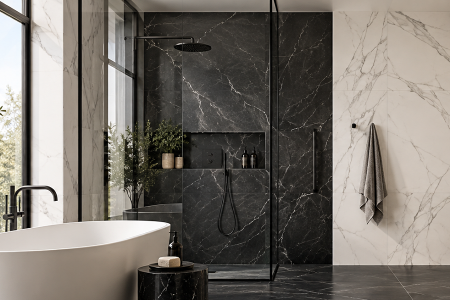
A well-planned black and white bathroom tiles design is about more than combining two contrasting colours. The strongest schemes control visual weight, decide where darker and lighter surfaces should dominate, and coordinate grout, lighting, fixtures and joinery as one composition. Showtile helps homeowners, designers and builders create monochrome bathrooms that feel balanced, architectural and considered rather than overly graphic.
How Should Black and White Be Balanced in a Bathroom?
Black and white bathrooms usually feel more resolved when one colour becomes the dominant field and the second colour is used strategically. Equal physical coverage does not necessarily create visual balance because darker surfaces generally carry more visual weight.
Should White Be the Dominant Colour?
White is often a practical dominant tone where the bathroom is compact, receives limited daylight or includes darker cabinetry.
A predominantly white scheme can create space for black to appear through:
- Flooring
- Vanity details
- Shower frames
- Tapware
- Niches
- Feature walls
This approach makes black more noticeable without allowing darker surfaces to overwhelm the room.
When Should Black Take a Stronger Role?
Black can take a larger role in spacious bathrooms, darker luxury interiors or rooms with generous natural light.
A black wall behind a bath, vanity or walk-in shower can create depth and architectural focus. A darker floor can also visually ground lighter walls and fixtures.
The decision should be based on room proportion and light rather than a fixed colour formula.
Is a 50/50 Black-and-White Split Always Effective?
No.
A bathroom with equal areas of black and white can still feel heavily weighted toward black because darker surfaces tend to attract more visual attention.
A stronger method is to identify the dominant surface first and then place contrast only where the architecture benefits from additional definition.
Where Should Black Tiles Be Used for the Strongest Effect?
Black tiles work best when their position reinforces an architectural feature or establishes a clear visual base. Scattered dark patches can make a bathroom feel disjointed, while one deliberate dark plane creates a stronger composition.
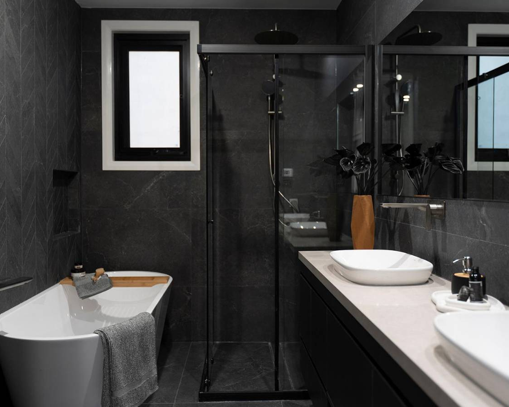
Black and white tiles create a bold bathroom contrast
Does a Black Floor Work Better Than a Black Wall?
Both approaches can work, but they create different effects.
A black floor gives the room a strong foundation and can make lighter walls appear more prominent. A black wall draws the eye vertically and creates a more dramatic focal point.
The choice also affects maintenance perception. Darker surfaces can make dust, mineral residue or water marks more visible depending on the finish and local water conditions.
Can One Black Feature Wall Be Enough?
Yes.
A single black surface can provide all the contrast a bathroom needs when the surrounding palette remains controlled.
Suitable locations include:
- Vanity wall
- Shower end wall
- Bath backdrop
- Recessed feature plane
This approach works particularly well when the bathroom already contains strong material elements such as stone benchtops or timber joinery.
Should Black Be Repeated in Smaller Details?
Controlled repetition can make the main black surface feel intentional.
Black can reappear in:
- Mirror frames
- Shower framing
- Tapware
- Hardware
- Small mosaic details
The repetition should support the main feature rather than create a series of unrelated dark accents.
How Should White Tiles Support a Black-and-White Scheme?
White tiles create breathing room around darker elements and help control the visual weight of the bathroom. White surfaces can also reflect more available light and prevent strong black features from becoming visually dominant.
Should White Tiles Be Plain or Veined?
Both can work.
Plain white creates a sharper, more graphic contrast, while subtle marble or stone movement softens the transition between black and white.
T-Marble can support a quieter marble-inspired direction where the white surface needs some visual movement without becoming overly decorative.
Can Off-White Work Better Than Pure White?
Yes.
Off-white, ivory and warm stone tones can make a monochrome bathroom feel less clinical. These colours also coordinate naturally with timber vanities, warm lighting and brushed metal fixtures.
A strict black-and-pure-white palette creates a stronger graphic identity, while softened white produces a calmer interpretation of the same concept.
How Can Pattern Change a Black-and-White Bathroom?
Pattern increases the frequency of contrast, so black-and-white pattern should usually be concentrated in one clear area. When every surface contains strong pattern, the bathroom can quickly become visually busy.
When Does Checkerboard Work Best?
Checkerboard flooring works particularly well in bathrooms that combine classic references with contemporary fixtures.
A checkerboard floor can become the main decorative element while wall surfaces remain quieter.
The pattern becomes less effective when combined with several other strong elements such as dramatic marble veining, contrasting grout and patterned wall tiles.
Can Basketweave Make the Bathroom Feel More Classic?
Yes.
Basketweave introduces smaller-scale repetition and can give the bathroom a more detailed, traditional character.
This type of pattern works well on:
- Bathroom floors
- Shower floors
- Vanity zones
- Selected feature areas
The wider mosaic tile collection also provides smaller-format options that can introduce black-and-white detail without covering an entire wall.
When Should Mosaics Be Used Instead of Large Tiles?
Mosaics are most effective when the small format serves a specific function or design purpose.
Useful applications include:
- Shower floors
- Niches
- Splashbacks
- Compact decorative panels
Larger surfaces can then remain visually quieter, creating contrast between the main material field and the detailed zone.
How Does Tile Scale Change Black-and-White Contrast?
Tile scale determines how often the eye encounters grout lines, tonal changes and pattern repetition. Large formats create broader areas of black or white, while smaller tiles increase visual rhythm.
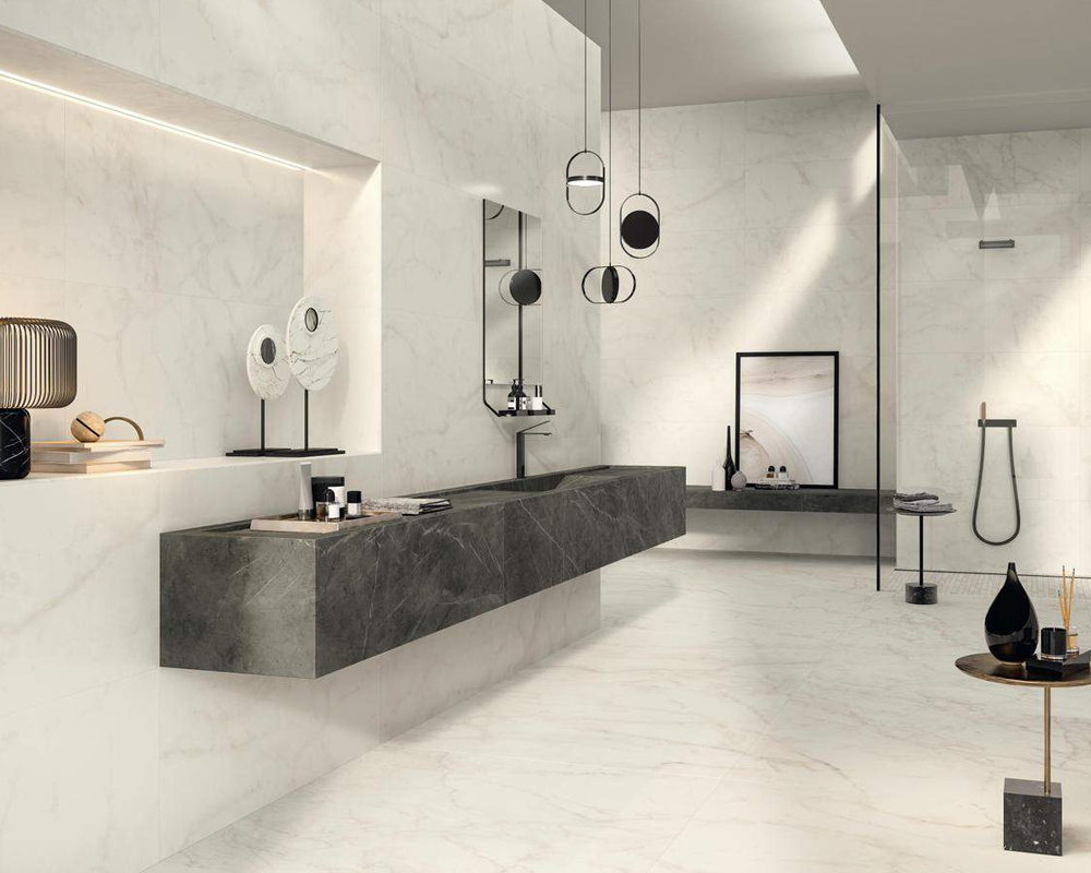
Light and dark finishes create a timeless bathroom look
Do Large Tiles Make the Bathroom Feel Calmer?
Generally, larger formats create fewer visible joints and allow colour or veining to read as a broader surface.
Porcelain slab tiles can support this direction where the project calls for expansive surfaces with fewer interruptions.
Large formats are especially effective in bathrooms where the design relies on strong black-and-white planes rather than repeated pattern.
Can Small Tiles Make Contrast Feel Stronger?
Yes.
A small black-and-white mosaic repeats the contrast many times across a limited area. The visual effect can therefore be stronger than using one large black wall beside one large white wall.
Small formats should be used deliberately when a more graphic result is desired.
Should Large Black Tiles Be Used in Small Bathrooms?
They can be.
Room size alone does not determine whether a dark tile is appropriate. Natural light, wall coverage, fixture colour, grout and the amount of surrounding white all influence the result.
A compact bathroom may still support a black floor or one dark wall when the remaining surfaces stay lighter.
How Should Grout Be Used in a Black-and-White Bathroom?
Grout can either reduce or intensify contrast. Matching grout helps the tile surface read as a continuous field, while contrasting grout emphasizes every joint.
Should Black Tiles Have Black Grout?
Dark grout can make a black tiled surface appear more unified.
This works particularly well when the design goal is a strong dark plane rather than a visible grid.
However, grout colour should still be selected according to the tile, installation requirements and desired maintenance characteristics.
Should White Tiles Have White Grout?
A close white or light grout can reduce the visibility of joints and keep the wall visually clean.
This approach works well where the room already contains a strong black floor or feature wall.
When Does Contrasting Grout Work Better?
Contrasting grout works when the tile grid is deliberately part of the design.
For example, subway tiles can create a graphic wall when light tiles are paired with darker grout.
The result is more expressive, so contrasting grout should not automatically be combined with every other patterned element in the room.
Which Material Direction Works Best for Black and White Bathrooms?
The material should determine how sharp or soft the black-and-white contrast feels. Porcelain can create controlled colour fields, while stone-inspired and natural materials introduce movement and tonal variation.
When Does Marble Look More Luxurious?
Marble-inspired surfaces can soften a strict monochrome palette because veins introduce intermediate grey tones between black and white.
A white marble-look surface paired with controlled dark accents often creates a quieter luxury effect than a completely solid black-and-white combination.
The broader stone-look tile collection is useful for schemes where the bathroom needs tonal movement without introducing another dominant colour family.
When Does Natural Stone Add More Character?
Natural stone introduces variation that is less uniform than manufactured surfaces.
The natural stone tile collection can be considered where authentic texture and material variation are part of the design concept.
Athena is particularly useful for controlled feature applications where smaller natural-stone formats can add depth without dominating the whole bathroom.
Can Porcelain Create a Cleaner Monochrome Finish?
Yes.
Porcelain is useful when the design needs repeated formats, controlled tones and surfaces that relate consistently across walls and floors.
The cleaner material language also works well when the bathroom architecture already contains strong joinery, mirrors or fixtures.
How Should Fixtures Work With Black and White Tiles?
Fixtures should support the monochrome palette without making every bathroom element either black or white. A third material such as timber or brushed metal can soften the scheme and prevent the room from looking overly graphic.
Does Black Tapware Create Too Much Contrast?
Not necessarily.
Black tapware can create continuity when dark tones already appear in the floor, wall or shower frame.
The strongest result usually comes from repetition rather than isolated black fittings.
When Does Brushed Brass Work Better?
Brushed brass or other warmer metal finishes can break up a strict monochrome palette.
Warm metals are particularly effective when white surfaces have softer ivory undertones or when timber joinery is also present.
Should the Vanity Match the Tile Palette?
The vanity does not need to be black or white.
Timber, warm neutral lacquer or charcoal cabinetry can act as a bridge between the two tile tones.
The same principle appears across broader design tiles for home planning: adjoining materials should belong to one overall palette without needing to match exactly.
How Does Lighting Change Black and White Bathroom Tiles?
Lighting strongly affects the perceived contrast between black and white surfaces. Dark tiles can lose detail under weak lighting, while highly reflective white tiles can create glare under strong direct illumination.
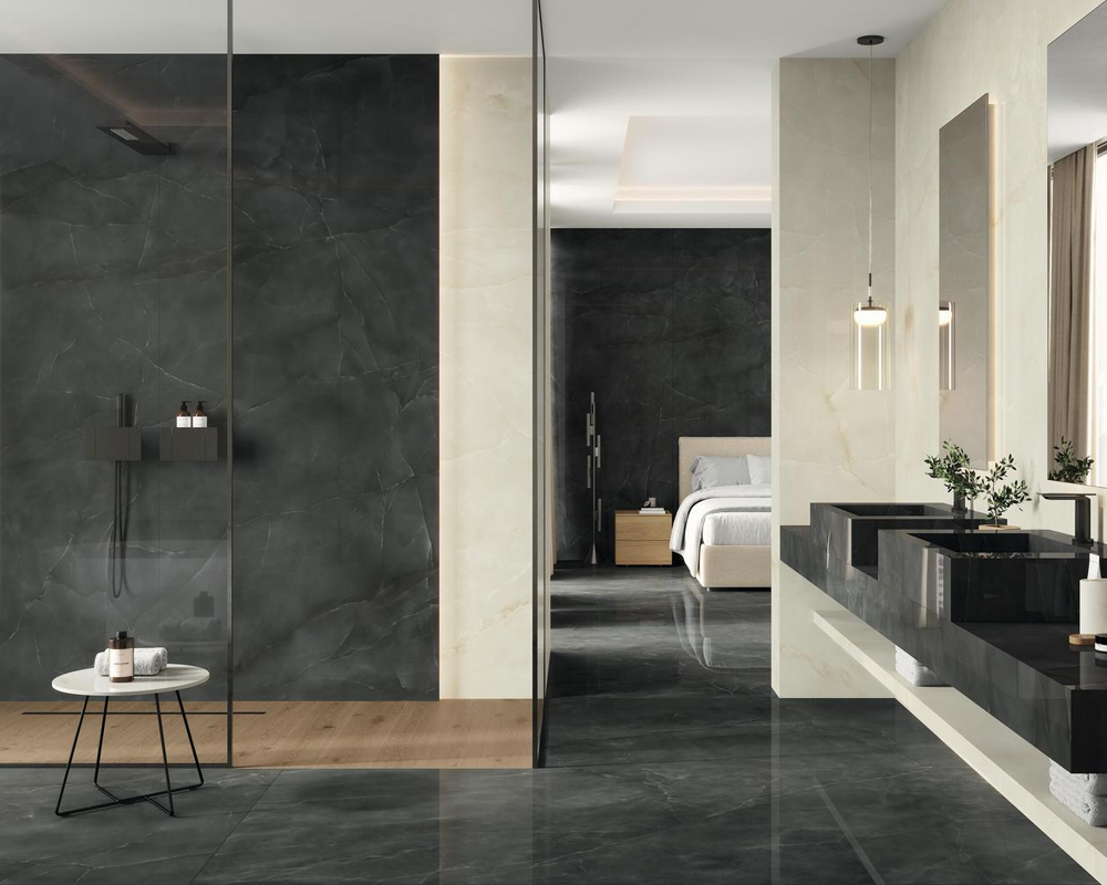
Controlled contrast keeps the bathroom clean and cohesive
Why Does Natural Light Matter More With Dark Tiles?
Natural light reveals texture and tonal variation within black surfaces.
Without sufficient light, a detailed dark stone or porcelain tile may appear as one flat visual mass.
This is especially important for feature walls where the surface itself is meant to contribute architectural depth.
Can Polished White Tiles Increase Brightness?
Reflective surfaces can distribute more light through the room, but the result depends on fixture position and surface angle.
Too much polished material may create unwanted reflections around mirrors and lighting.
A mix of matt and reflective finishes often creates a more controlled bathroom.
How Should Black Feature Walls Be Lit?
A black feature wall benefits from directional or indirect lighting.
Useful approaches include:
- Wall washing
- Vanity sconces
- Concealed lighting
- Downlights positioned to reveal texture
Lighting should reveal the dark surface rather than simply illuminate the centre of the bathroom.
Can Black and White Tiles Work in a Small Bathroom?
Yes. Small bathrooms can use black and white successfully when contrast is concentrated rather than distributed randomly across every wall. A light dominant field with carefully positioned black surfaces usually keeps the room easier to read.
Should Small Bathrooms Use More White Than Black?
Often, yes.
Light walls can reduce visual weight around the room, while a dark floor or limited feature wall provides enough contrast to define the design.
This approach is particularly useful in ensuites with limited natural light.
Where Can Black Be Concentrated?
Black can be limited to:
- Floor
- Vanity wall
- Shower niche
- Shower frame
- Small mosaic panel
A restrained approach connects naturally with the principles used in simple bathroom tile planning, where fewer material changes help maintain stronger visual continuity.
Can a Black Floor Make a Small Bathroom Feel Smaller?
Not automatically.
A dark floor can create visual weight at the base of the room while lighter walls keep the upper volume open.
The overall effect depends more on the complete composition than on floor colour alone.
How Can Black and White Bathrooms Avoid Looking Too Harsh?
A black-and-white bathroom feels softer when the scheme includes variation in texture, warmth or material character. The room can remain monochrome without every surface becoming sharply graphic.
Can Timber Soften the Palette?
Yes.
Timber vanity fronts, shelving or cabinetry introduce warmth and natural texture.
Timber-look tiles can also support adjoining spaces where visual warmth needs to continue beyond the bathroom.
Can Stone Veining Make the Scheme Feel Less Graphic?
Yes.
Grey veining provides an intermediate tone between black and white and makes transitions feel more gradual.
This can be particularly useful when the bathroom uses strong black fixtures.
Should Every Surface Be High Contrast?
No.
Some surfaces should remain quiet so the main black-and-white relationship can be understood immediately.
Introducing strong vivid pattern tiles can work in a controlled feature area, but several equally dominant patterned surfaces can weaken the overall hierarchy.
How Do Black-and-White Bathroom Directions Compare?
| Design Direction | Main Tile Approach | Visual Effect | Main Consideration |
| Light contemporary bathroom | White base with black accents | Bright and structured | Keep black controlled |
| Dark luxury ensuite | Dark wall or floor with lighter surfaces | Intimate and dramatic | Lighting |
| Classic monochrome | Checkerboard or mosaic pattern | Detailed and timeless | Pattern density |
| Minimal bathroom | Large black and white fields | Clean and architectural | Accurate set-out |
| Marble-inspired bathroom | White veining with dark accents | Softer luxury contrast | Vein intensity |
| Compact ensuite | Light walls with dark floor/detail | Balanced visual weight | Natural light |
The best direction depends on bathroom proportion, available light, material preference and the amount of visual contrast the room can comfortably support.
What Can Make a Black-and-White Bathroom Feel Unbalanced?
A monochrome bathroom becomes difficult to read when every surface competes at the same visual strength. Strong black areas, pattern, grout and fixtures should be prioritized rather than layered indiscriminately.
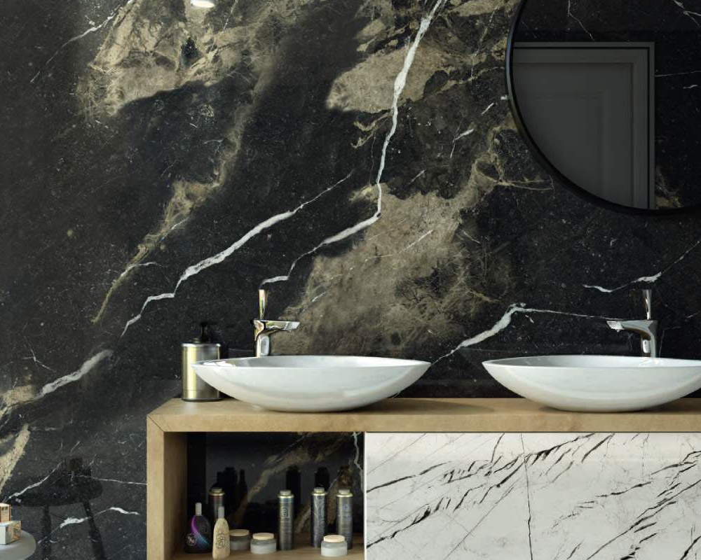
Monochrome surfaces bring structure and visual balance
Can Too Much Black Overwhelm the Room?
Yes.
This is more likely where natural light is limited or the ceiling is low.
Black can remain a strong component while being concentrated on one or two surfaces.
Can Too Much White Make the Bathroom Feel Clinical?
Yes.
Pure white walls, cool lighting and highly reflective fittings can create a harder atmosphere.
Texture, off-white tones, timber and softer lighting can prevent the scheme from feeling sterile.
Can Too Many Patterns Compete With Each Other?
Yes.
Avoid allowing checkerboard flooring, marble veining, patterned mosaics and contrasting grout to all become primary features.
One pattern should usually lead while the other surfaces support it.
Can Poor Tile Placement Make Contrast Feel Random?
Yes.
Dark and light transitions should follow architectural logic such as:
- Wall changes
- Niches
- Bath zones
- Shower boundaries
- Vanity alignment
The same principle of deliberate material transition also applies to stair tiles design, where changes in surface, edge and tone should reinforce the architecture rather than interrupt it.
Balance Black and White Surfaces With Showtile
A balanced black-and-white bathroom is easier to achieve when colour, proportion and surface character are considered as part of one complete material scheme. Showtile helps designers, builders and homeowners compare finishes with the wider architecture, lighting and interior palette in mind.
The broader Showtile collection makes it easier to explore coordinated surface options and assess how lighter and darker finishes can work together before the bathroom palette is finalised.
Rather than relying on contrast alone, a stronger result comes from creating clear visual hierarchy and allowing each surface to support the overall composition. With a considered material direction, a black-and-white bathroom can feel distinctive, balanced and enduring without becoming overly decorative.
Contact Showtile
📍 Showroom: 65 Canterbury Road, Bankstown NSW 2200, Australia
📞 Phone: +61 2 9709 5836
✉️ Email: sales@showtile.com.au
🌐 Website: https://showtile.com.au/



