


Bathroom Tiles Designs and Colours: How to Build a Balanced Palette
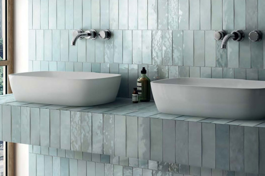
Choosing bathroom tiles designs and colours is easier when the palette is planned as one complete composition. Showtile offers neutral porcelain, terrazzo, stone-look and coloured wall tiles that can be coordinated with vanities, tapware, grout and lighting to create bathrooms with clearer colour balance and stronger visual harmony.
How Should Bathroom Tile Colours Be Planned as One Palette?
A balanced bathroom usually starts with a dominant neutral, followed by a supporting tone and a smaller accent. Floor and wall tiles do not need to match exactly, but their undertones should relate closely enough for the room to feel intentional.
What Should Be the Dominant Bathroom Colour?
The dominant tone normally appears across the largest surfaces, such as:
- Main walls
- Shower walls
- Broad floor areas
- Bath surrounds
Ivory, beige, greige, limestone and soft grey are useful dominant colours because they leave room for stronger vanity, metal and accessory choices.
The dominant colour should provide stability rather than become the most expressive part of the bathroom.
How Many Colours Should a Bathroom Use?
A practical hierarchy is:
- Around 60% dominant colour
- Around 30% supporting material or tone
- Around 10% accent
This is not a strict mathematical rule, but it helps prevent several colours from competing equally.
For example, a bathroom could use warm greige across the main walls, a slightly deeper stone tone on the floor and muted green subway tiles behind the vanity.
Why Do Undertones Matter More Than Exact Colour Matching?
Two tiles may both appear beige but still clash if one contains a strong yellow undertone and the other leans pink or grey.
Always compare:
- Tile samples
- Vanity timber
- Benchtop
- Wall paint
- Metal finishes
- Grout
A coordinated undertone creates greater visual harmony than selecting finishes simply because they share the same colour name.
Which Neutral Tile Colours Work Best in Bathrooms?
Neutral palettes remain popular because they provide flexibility and age well, but each neutral creates a different atmosphere.
When Do White and Ivory Tiles Work Best?
White and ivory can make a bathroom feel bright and open.
Pure white creates a crisp look, while ivory softens the room and often pairs more naturally with timber, warm stone and brass.
To stop a pale bathroom from feeling flat, introduce variation through:
- Surface texture
- Natural movement
- Tonal grout
- Timber cabinetry
- Layered lighting
A pale palette does not need several contrasting colours to feel detailed.
Why Are Beige and Greige Bathrooms Effective?
Beige and greige offer a warmer alternative to cool grey.
Valencia is a stone-look porcelain collection with Mist, Cotton and Bianco colour directions, allowing a bathroom to move from warm neutral to softer grey while keeping a consistent stone character.
These tones work particularly well with:
- Oak or walnut vanities
- Cream walls
- Brushed nickel
- Brass
- Off-white benchtops
When Does Grey Work Better?
Grey suits bathrooms with a cleaner architectural character.
Grey tiles pair naturally with black tapware, dark joinery and cooler stone surfaces. However, warm grey and cool grey should be treated differently because the undertone changes how timber and lighting appear beside the tile.
For a deeper treatment of tonal grey schemes, the principles in bathroom wall design tiles can support wall-specific material planning without requiring the entire bathroom to use the same colour.
When Should a Bathroom Use Colour Beyond Neutrals?
Colour works best when it has a specific role. A carefully placed green, blue or dark tile can add character without taking control of the whole room.
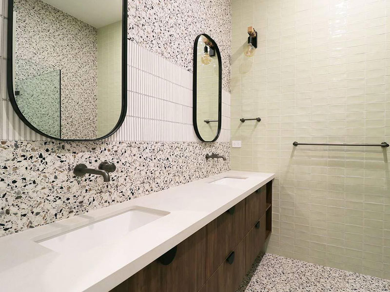
Thoughtful tile combinations add depth and character
How Can Green Tiles Be Used Without Overwhelming the Room?
Green works well in:
- Vanity splashbacks
- Shower feature walls
- Niches
- Half-height walls
Pair muted green with:
- Warm white
- Beige stone
- Walnut
- Brass
A coloured tile becomes easier to manage when the remaining surfaces stay quiet.
When Do Blue Tiles Suit a Bathroom?
Blue can create a coastal, fresh or spa-inspired direction.
Soft blue works naturally with white, pale stone, timber and chrome. Deeper blue can create a stronger feature, especially in powder rooms or smaller decorative zones.
The blue tile should connect with at least one other element in the room, such as cabinetry, artwork or accessories.
Can Black or Charcoal Tiles Work in a Bathroom?
Yes.
Dark colours work best when:
- The bathroom has sufficient light
- The feature area is clearly defined
- Pale materials provide contrast
- Grout lines are controlled
Black and charcoal are particularly effective on a shower wall, floor or vanity backdrop rather than every surface at once.
Should Bathroom Floor and Wall Tiles Be the Same Colour?
Floor and wall tiles do not need to match. A tonal relationship usually produces a more sophisticated result than exact repetition.
When Does a Tonal Scheme Work Best?
A tonal scheme uses related shades from one colour family.
For example:
- Pale beige wall
- Mid-tone beige floor
- Cream grout
- Oak vanity
This creates continuity while maintaining enough variation to distinguish horizontal and vertical surfaces.
When Should the Floor Be Darker Than the Walls?
A slightly deeper floor can visually ground the bathroom.
This works well when:
- Wall surfaces are pale
- The room has strong natural light
- The floor needs greater definition
- A vanity or bath sits against lighter walls
The contrast should usually remain moderate rather than dramatic.
When Can the Wall Be Darker Than the Floor?
A darker wall works when the bathroom needs a clear focal point.
Good locations include:
- Shower wall
- Bath wall
- Vanity wall
A lighter floor can then prevent the room from feeling enclosed.
How Should Stone-Look, Marble-Look and Terrazzo Colours Be Combined?
Material character influences colour just as much as the base hue. Stone, marble and terrazzo all introduce different types of visual movement.
When Does Stone-Look Tile Create the Best Base?
Stone-look porcelain works well across large areas because the pattern is usually quieter than strong marble veining.
It can provide:
- Soft movement
- Natural variation
- Warm or cool neutrals
- Broad visual continuity
Stone-look surfaces are particularly effective when the bathroom includes timber, because the two materials create a balanced natural palette.
How Should Marble Veining Influence Other Colours?
Use the marble vein as a guide for secondary colours.
Examples:
- Grey veins → grey or nickel accents
- Gold veins → brass and warm timber
- Beige veins → cream and stone
- Charcoal veins → darker joinery
The supporting colours do not need to copy the marble exactly. They simply need to belong to the same undertone family.
When Does Terrazzo Work as a Colour Connector?
Terrazzo can bring several tones together because the aggregate naturally includes more than one colour.
Terra Terrazzo is available in white, grey and multi-tone directions and can be used on walls and floors.
Terrazzo works especially well when the bathroom needs a surface that links vanity, wall and floor colours without introducing strong directional veining.
How Should Feature Tiles Be Added to a Bathroom Colour Scheme?
Feature tiles should strengthen one architectural zone rather than become repeated decoration.
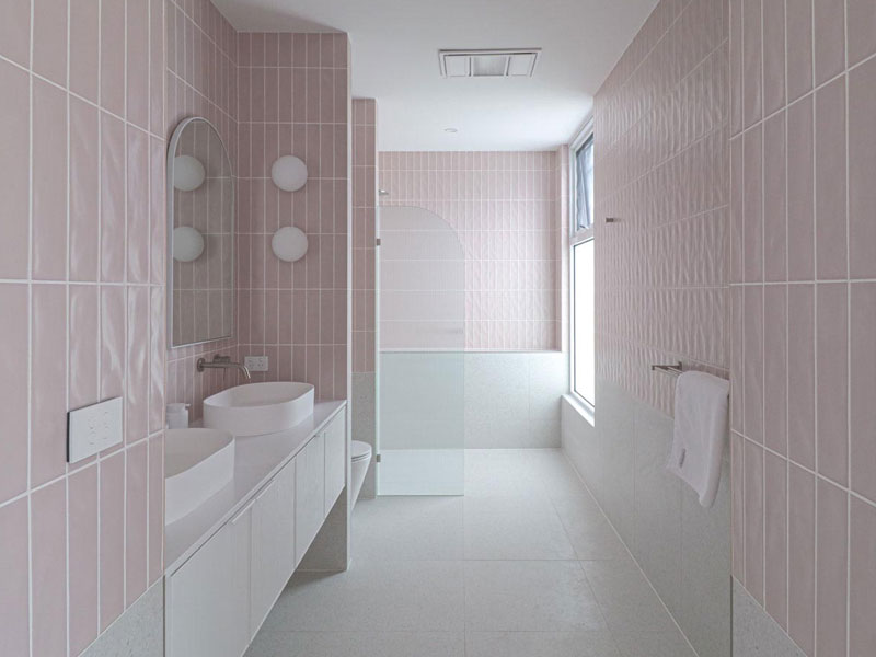
Soft tones create a calm, cohesive space
Where Should the Strongest Colour Be Placed?
The strongest colour can sit on:
- Vanity wall
- Shower wall
- Bath wall
- Niche
- Small return wall
Choose one primary feature location first.
Adding another strong pattern on the opposite wall can weaken the original focal point.
When Do Subway Tiles Work as a Colour Accent?
Subway tiles are useful when colour is important but the feature should remain controlled.
Sevilla Subway currently offers black, blue, green, grey, pink and white in a glossy ceramic wall format with strong tonal variation.
This type of tile can introduce colour around a vanity or shower without requiring the whole bathroom to shift away from a neutral base.
When Do Mosaics Work Better Than Larger Feature Tiles?
Mosaics suit smaller, detailed areas.
Use them for:
- Shower niches
- Splashbacks
- Small accent panels
- Selected shower floors where technically suitable
Because mosaics introduce more grout lines, the grout colour becomes part of the design rather than a background detail.
How Should Tile Colour Change With Bathroom Size?
Bathroom size affects how much colour and contrast the room can comfortably support.
Which Colours Work Best in Smaller Bathrooms?
Light ivory, pale greige, soft stone and low-contrast grey can reduce visual boundaries.
This does not mean a small bathroom must be entirely white.
A compact room can still use one darker feature if the surrounding palette remains controlled.
Can Dark Tiles Work in a Small Bathroom?
Yes.
Dark tile can create a dramatic, intimate effect when:
- Lighting is carefully planned
- Grout does not create excessive contrast
- Mirrors add reflection
- Lighter fixtures balance the scheme
The key is intentional contrast rather than simply avoiding dark colours.
How Can One Colour Make a Small Bathroom Feel More Continuous?
Using related tones across floor, wall and grout reduces the number of visual breaks.
A warm greige floor, slightly lighter greige wall and matching grout can make the room feel calmer than three unrelated colours.
How Does Tile Finish Change Bathroom Colour?
The same colour can appear significantly different in matt, gloss or honed finishes.
Why Does Matt Tile Look Softer?
Matt surfaces reflect less direct light.
The colour tends to feel:
- More muted
- More architectural
- Softer
- Less visually active
Urban Concrete uses a refined matt finish across Bianco, Greige, Mid Grey and Dark Grey, illustrating how one material language can move through several neutral depths.
Why Does Gloss Make Colour Feel Stronger?
Gloss reflects light, which can increase the apparent depth and saturation of coloured tiles.
Glossy green or blue subway tiles can therefore feel more expressive than the same hue in a matt finish.
How Does Honed Finish Affect Neutral Colours?
Honed surfaces introduce a subtle sheen without becoming highly reflective.
This can work well for bathrooms aiming for a soft luxury character where stone movement should remain visible but not glossy.
How Should Grout Colour Be Chosen With Bathroom Tiles?
Grout changes how clearly the tile pattern is perceived.
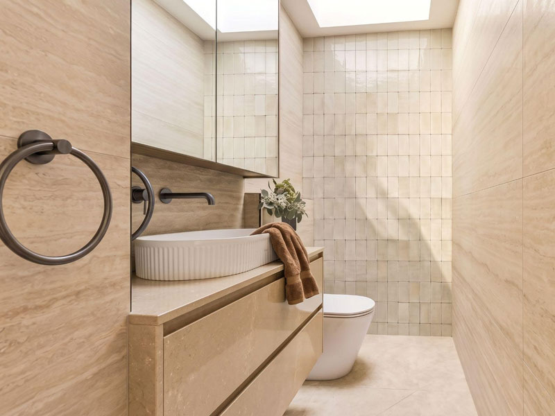
Balanced tile colours for a refined bathroom
When Should Grout Blend With the Tile?
Use similar grout when the goal is:
- Visual continuity
- Quiet luxury
- Large-format surfaces
- Tonal colour schemes
The tile reads as a broader plane rather than a visible grid.
When Should Grout Contrast?
Contrast grout can work with:
- Subway tiles
- Geometric mosaics
- Strong decorative patterns
The grout becomes part of the graphic design.
Can Grout Change How Strong the Tile Colour Appears?
Yes.
A white grout around green tile makes each tile shape more obvious, while green or tonal grout creates a more continuous coloured surface.
For projects where several interior spaces need coordinated material logic, ideas from design tiles for living room can also help frame how colour, furniture and hard surfaces relate across the wider home.
How Should Bathroom Tiles Coordinate With Vanity and Tapware Colours?
The tile palette should be reviewed beside cabinetry and metal finishes before ordering.
Which Tile Colours Work With Timber Vanities?
Timber works naturally with:
- Beige
- Ivory
- Warm grey
- Limestone tones
- Soft green
The warm grain of timber can soften porcelain and stone-inspired surfaces.
Which Tiles Work With Brass Tapware?
Brass pairs well with:
- Cream
- Travertine tones
- Warm white
- Green
- Gold-vein marble
The warmer the tile undertone, the more naturally brass tends to integrate.
Which Tiles Work With Black Tapware?
Black tapware creates stronger contrast.
Pair it with:
- Pale stone
- Soft grey
- Beige
- White
Black can also work with darker tile, but the room then needs careful lighting and material variation to maintain definition.
How Does Lighting Change Bathroom Tile Colour?
Lighting should be treated as part of the colour scheme.
Why Should Tiles Be Viewed in Natural and Artificial Light?
Daylight reveals undertones clearly, while warm or cool LEDs can shift how beige, grey, green and white are perceived.
Always check samples during both daytime and evening conditions.
How Does Directional Lighting Affect Textured Tiles?
Directional lighting creates highlights and shadows across textured tile.
As a result, one colour can appear to contain several tonal depths depending on the viewing angle.
Why Should Tile Samples Be Viewed Vertically and Horizontally?
A tile positioned on a wall receives light differently from the same tile laid flat.
Wall samples may appear brighter, while floor samples often read darker or more muted.
This simple test can prevent unexpected colour differences after installation.
Which Bathroom Colour Direction Best Fits the Interior?
| Bathroom Direction | Main Tile Colour | Supporting Material | Overall Effect |
| Quiet luxury | Warm greige | Timber + brushed nickel | Calm and refined |
| Spa-inspired | Beige / limestone | Oak + cream | Soft and relaxing |
| Contemporary | Grey | Black metal + white | Architectural |
| Classic | White / Carrara | Chrome + pale timber | Timeless |
| Nature-led | Green accent | Beige + walnut | Organic and layered |
| Coastal | Soft blue / white | Pale timber + chrome | Fresh and light |
| Dramatic | Charcoal / black | Pale stone + warm light | Bold and intimate |
| Boutique luxury | Marble + warm neutral | Brass + timber | Rich and polished |
The underlying principle is the same one used when coordinating floor tiles design for living room: large surfaces should establish a stable base while smaller materials provide contrast and character.
What Technical Details Should Be Checked Alongside Bathroom Colour?
Colour alone does not determine whether a tile is suitable for a particular bathroom surface.
Why Must Floor Suitability Be Checked Separately?
A wall tile that looks perfect beside the vanity may not be appropriate for the floor.
Check:
- Intended application
- Surface finish
- Slip performance
- Manufacturer specification
Aesthetic continuity should never replace technical suitability.
Why Does Batch Variation Matter?
Tile colour can vary between production batches, particularly with natural stone, handmade products and intentionally varied ceramic surfaces.
Order sufficient material together whenever possible.
Why Should Several Tile Faces Be Reviewed Together?
Stone-look, marble-look and terrazzo porcelain can contain multiple face designs.
Reviewing several tiles helps reveal:
- Pattern balance
- Colour variation
- Vein distribution
- Repetition
A single sample cannot show the appearance of an entire bathroom.
What Should Be Checked Before Finalising a Bathroom Colour Palette?
Before ordering, confirm:
- Dominant colour
- Supporting tone
- Accent colour
- Warm or cool undertone
- Floor-wall relationship
- Vanity finish
- Benchtop material
- Tapware colour
- Grout colour
- Natural light
- Artificial lighting
- Tile finish
- Wet-area suitability
- Batch variation
- Wastage allowance
If the project requires more detailed wall-specific planning, the dedicated guide to bathroom wall design tiles can help refine layout, finish and wall treatment without changing the overall colour strategy.
How Can Showtile Materials Build Different Bathroom Colour Palettes?
The Showtile tile collection includes stone-look porcelain, terrazzo, concrete-look surfaces, colourful ceramic wall tiles and natural materials that can support very different bathroom palettes.
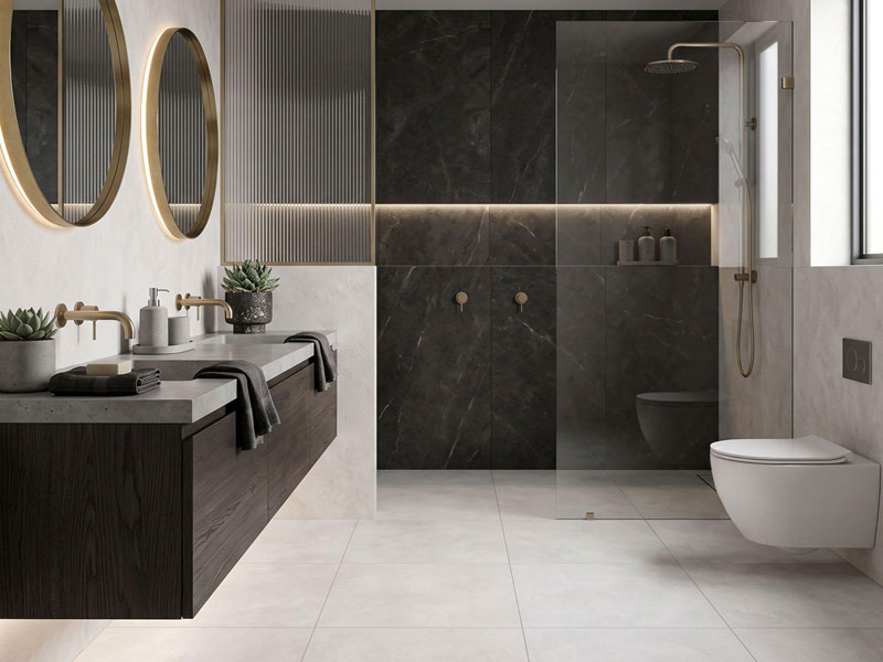
Elegant finishes bring harmony to the bathroom
For a warm neutral bathroom, Valencia can provide a soft stone-inspired base. For a cooler architectural scheme, Urban Concrete offers Bianco, Greige, Mid Grey and Dark Grey across wall and floor formats.
For more expressive colour, Sevilla Subway introduces blue, green, pink and other glossy wall tones, while Alpha Terrazzo extends colour through blue, green, pink, white, charcoal and multi-tone aggregate patterns.
The strongest approach is to compare these surfaces as complete palettes rather than isolated samples. A specialist designer tiles company can help align tile colour with cabinetry, metals, lighting and adjoining rooms across a broader interior project.
Build the Bathroom Palette Before Choosing Individual Tiles
A successful bathroom colour scheme starts with relationships rather than isolated products. Floor, walls, vanity, tapware, grout and lighting should all contribute to the same visual direction.
At Showtile, neutral porcelain, coloured wall tiles, terrazzo and stone-inspired surfaces can be compared side by side to build a palette around the intended mood of the bathroom. Starting with colour hierarchy and undertone makes it easier to create a space that feels layered, cohesive and considered.
Contact Showtile
📍 Showroom: 65 Canterbury Road, Bankstown NSW 2200, Australia
📞 Phone: +61 2 9709 5836
✉️ Email: sales@showtile.com.au
🌐 Website: https://showtile.com.au/



