

Common Tile Mistakes That Undermine Luxury Interiors
Luxury interiors succeed or fail on restraint. Tiles sit quietly beneath furniture, light, and architecture, yet mistakes at this level are difficult to disguise. When tile decisions are rushed, over-styled, or poorly coordinated, the result is a space that feels unsettled rather than refined. Common tile mistakes that undermine luxury interiors often stem from scale, finish, layout, and material choices that ignore architectural intent. At Showtile, we frequently see these issues. They are not dramatic errors. They are subtle missteps that erode clarity and longevity over time.
Over-prioritising pattern instead of proportion
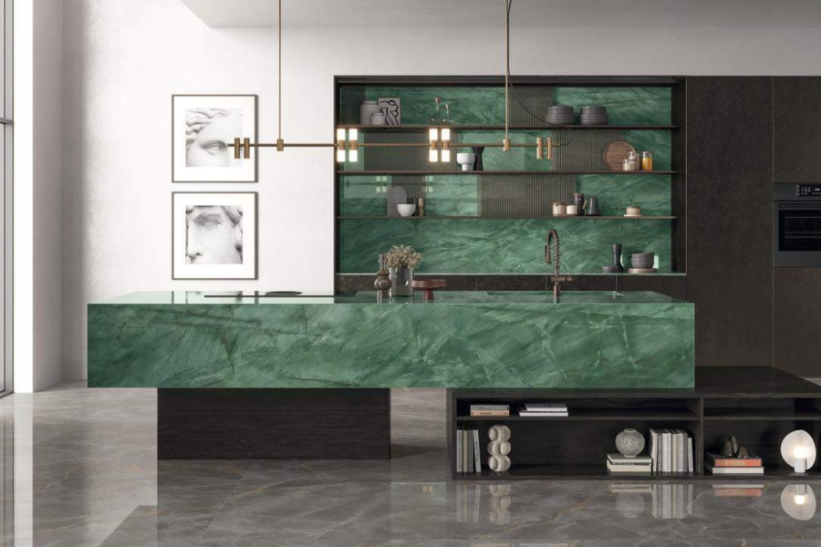
Choosing tiles for visual impact rather than scale and proportion often overwhelms the space. One of the most common tile mistakes in luxury interiors is selecting patterns that dominate rather than support the room.
Strong veining, bold graphics, or high-contrast designs can feel impressive in isolation, but quickly overpower living spaces when installed wall-to-wall. Luxury interiors rely on balance. Tiles should provide structure and calm, allowing furniture, joinery, and art to take focus. A restrained palette with controlled variation supports spatial flow and ensures the space remains adaptable over time. In large rooms, especially, excessive patterns introduce visual noise that competes with the architecture.
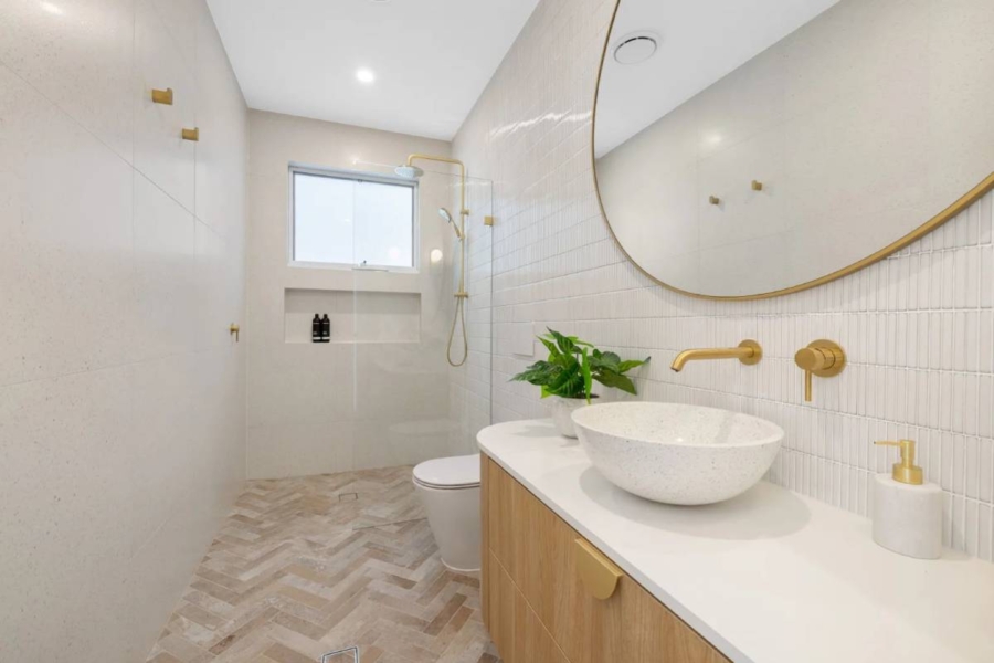
Ignoring scale and tile size
Small tiles in large spaces disrupt continuity and break architectural flow. Using small-format tiles in expansive living areas or open plan layouts creates unnecessary interruptions.
Scale matters in luxury interiors; large-format tiles create continuity, reducing visual breaks and reinforcing proportion. More tiles would also mean more grout lines, fragmenting the floor plane and visually shrinking the space. Large-format porcelain slabs in particular allow surfaces to read as unified planes rather than tiled assemblies. When tile size aligns with room scale, the result feels intentional and composed rather than busy.
Choosing finishes that fight the light
Gloss finishes amplify glare and disrupt comfort in living spaces. Finish plays a critical role in how a space feels throughout the day.
Choosing the wrong finish is a quiet mistake that undermines the experience of the space. High gloss tiles reflect light aggressively, which can cause glare, visual fatigue, and a lack of warmth. This is especially problematic in living rooms, kitchens, and open-plan areas where light shifts constantly. Matt and honed finishes absorb light softly, creating a calm, comfortable atmosphere. These finishes support relaxed living and allow natural and artificial light to reveal subtle texture rather than harsh reflection.
Treating every room as a separate design
Disconnected tile choices disrupt the flow and weaken the architectural intent. When living areas, kitchens, hallways, and bathrooms feel disconnected underfoot, the home loses coherence.
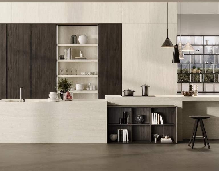
Selecting different tiles for adjacent spaces without a clear relationship breaks spatial flow. Luxury interiors benefit from continuity. Tiles should be considered as part of a broader architectural language. Extending the same tile or a closely related finish across multiple zones strengthens movement through the home. This approach supports clarity and reinforces architectural intent. Subtle changes in layout or orientation can define zones without sacrificing continuity.
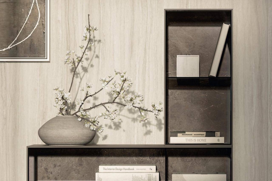
Overlooking grout colour and joint width
Poor grout choices draw attention away from the tile and disrupt visual calm. Grout is often treated as an afterthought, yet it plays a significant role in how tiles read.
High-contrast grout emphasises grid lines and draws focus to the joints rather than the surface. Wide grout joints further fragment the floor or wall plane. In luxury interiors, grout should recede visually. Matching grout tones to the tile surface creates a seamless effect that supports continuity. Narrow joints reinforce a refined finish and allow the tile to read as a unified surface rather than a collection of parts.
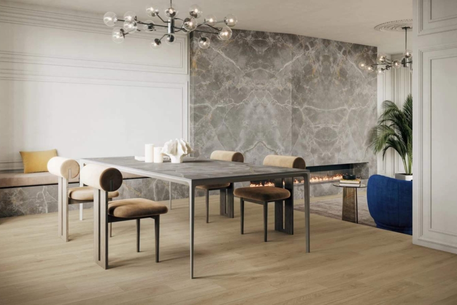
Using decorative tiles without restraint
Feature tiles lose impact when used excessively or without context. Limiting their use allows them to feel intentional and considered.
Pattern tiles can add depth and interest when used sparingly. The surrounding surfaces should remain calm so the feature can breathe.Problems arise when they are applied too broadly or without a clear architectural role. Overuse of decorative tiles turns feature elements into visual clutter. In luxury interiors, feature tiles work best as moments, such as a fireplace surround, a splashback, or a powder room wall tile.
Misaligning tile layout with architecture
Poor layout planning disrupts proportion and weakens spatial order. Tile layout should respond to the room, not the other way around.
In well-designed interiors, tile lines align with architectural elements such as sliding doors, cabinetry, and structural grids. This alignment reinforces proportion and makes the space feel resolved. Careful planning before installation is essential to avoid compromises that become permanent. Misaligned grout lines, awkward cuts, and layouts that ignore doorways or focal points undermine the sense of order.
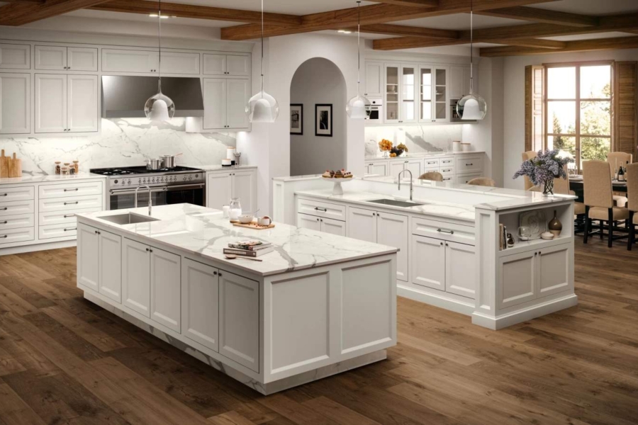
Selecting materials without considering daily use
Materials that look good but wear poorly undermine long-term luxury. Selecting tiles that stain easily, wear quickly, or require constant maintenance can introduce frustration into everyday living.
Luxury is not only about appearance. It is about how a space performs over time. Porcelain slabs are often preferred in luxury interiors for their durability and refined aesthetics. Stone-look porcelain offers tonal variation and warmth while maintaining consistency and ease of care. Materials should support the way the space is used, not demand constant attention.
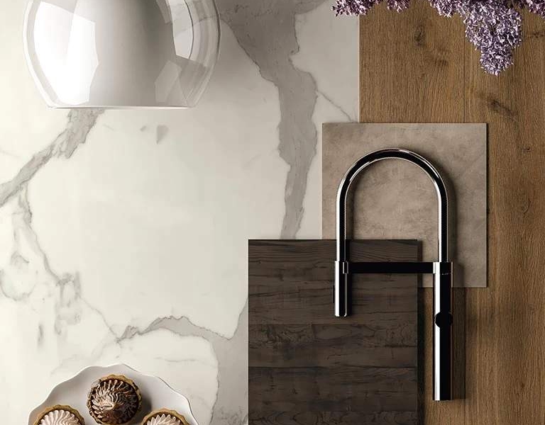
Forgetting how tiles interact with furniture and finishes
Tiles that compete with furnishings disrupt balance and hierarchy. Consider how tiles interact with timber, metal, fabric, and stone to ensure a cohesive result.
Tiles form the backdrop to furniture, joinery, and textiles. When tile colour or pattern competes with these elements, the room feels unsettled. Low contrast tiles allow furniture to define the space and create hierarchy. In living rooms, floors often act as a quiet canvas. Subtle tonal variation and restrained finishes support layered materiality without dominating it.
Neglecting lighting when selecting tiles
Tiles behave differently under natural and artificial light. Tiles selected under showroom lighting alone may perform differently once installed.
Lighting reveals the true character of tiles. Natural daylight highlights texture and variation, while evening lighting shapes mood. Matt and honed finishes tend to respond more predictably under mixed lighting conditions. Testing samples in the actual space helps confirm tone, texture, and finish before commitment. This step is often overlooked but is critical in luxury projects.
Avoiding professional guidance
Early advice prevents costly mistakes and design compromises. Many tile mistakes occur when decisions are made without expert input.
Choosing the wrong finish is a quiet mistake that undermines the experience of the space. High gloss tiles reflect light aggressively, which can cause glare, visual fatigue, and a lack of warmth. This is especially problematic in living rooms, kitchens, and open-plan areas where light shifts constantly. Matt and honed finishes absorb light softly, creating a calm, comfortable atmosphere. These finishes support relaxed living and allow natural and artificial light to reveal subtle texture rather than harsh reflection.
Guaranteed way to avoid mistakes
Common tile mistakes that undermine luxury interiors are rarely obvious at first glance, yet their impact grows over time. By prioritising scale, finish, layout, and continuity, tiles can support architecture rather than distract from it. At Showtile, our curated collections and design guidance help avoid these missteps, ensuring tiles contribute to spaces that feel calm, composed, and enduring.
To explore our collection or request architectural samples, contact us at sales@showtile.com.au or call (02) 9709 5836.

