Month: November 2025

Colour Palettes & Veining: Using Marble, Onyx & Gold-Veined Stones in Luxury Interiors

oynx marble tiles

In high-end design, colour rarely stands alone. It is shaped by light, finish, and the movement that veining introduces across a surface. 

From softly layered marbles to dramatic gold-veined stones, tonal variation has become the language of modern luxury. At ShowTile, we view colour palettes and veining not as decoration, but as a structural element. 

The interplay between hue and pattern defines proportion, rhythm, and atmosphere. A cool grey marble can feel architectural and quiet. 

A translucent onyx can project warmth and light. Gold-veined stone, meanwhile, captures the precision and drama that distinguish bespoke interiors. 

This is the art of visual balance. This is the ability to use natural tone. This is veining to sculpt emotion and intent.

The Architectural Role of Veining

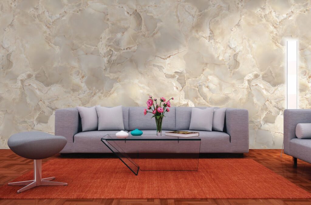
Veining guides the eye. It creates direction, accentuates form, and brings natural energy to structured interiors. Linear veining can elongate a wall or floor, emphasising scale and continuity. 

More irregular patterns, such as marble stone look tiles, provide movement and complexity. They prevent large surfaces from feeling static and lend an organic sensibility to geometric layouts. 

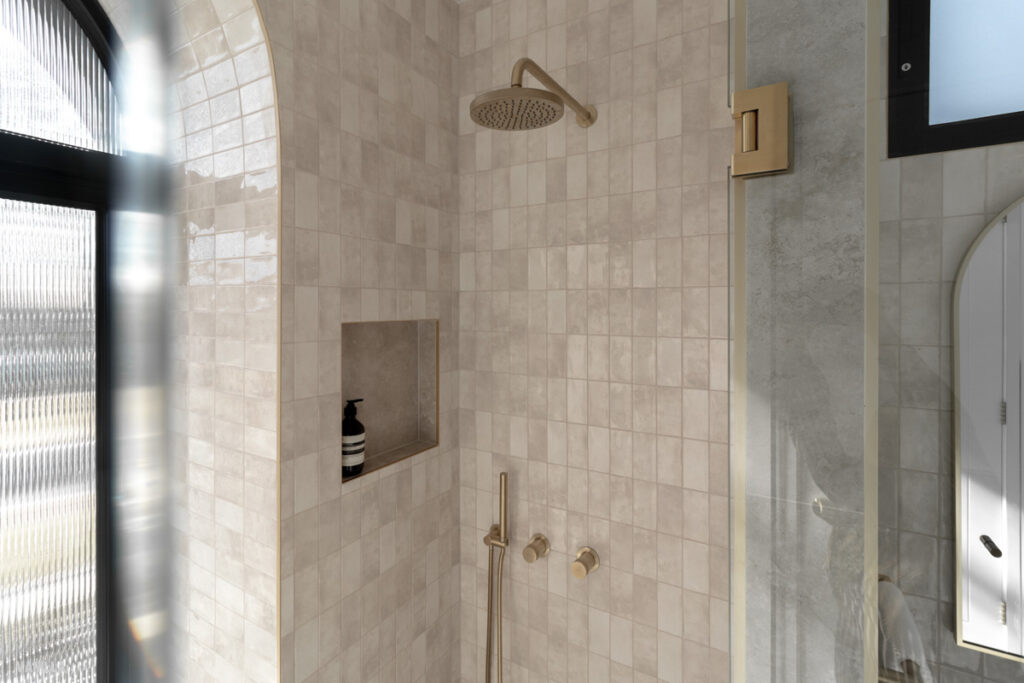
Architects often align veins deliberately between adjoining slabs, a technique known as bookmatching. The mirrored effect adds visual symmetry and establishes a central focal point ideal for feature walls, shower zones, or fireplaces.

ShowTile Design Advice: When used in soft tonal palettes, veining reads as texture rather than pattern, supporting other materials rather than competing with them.

marble look green tiles

Marble: The Foundation of Timeless Colour

Marble tiles remain a cornerstone of luxury design because of their tonal depth. Its palette moves easily between warmth and coolness, allowing designers to manipulate mood with precision.

White marbles lend purity and light. Their soft grey veining introduces dimension without distraction, making them suitable for minimalist bathrooms or gallery-style living spaces. 

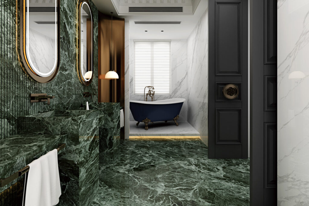
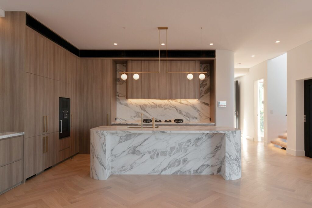
While darker marbles convey drama and intimacy, used sparingly, they ground pale interiors and contrast beautifully against brushed metal or oak finishes. Combine large-format marble look porcelain tiles to extend these aesthetics into more practical applications. 

This can replicate natural veining with remarkable fidelity while providing uniformity and easy maintenance. 

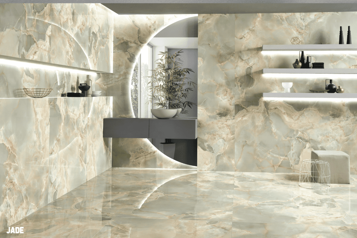
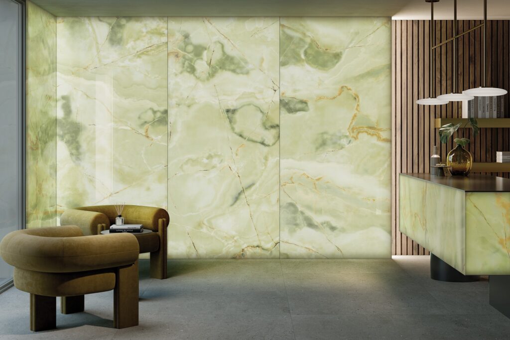
Onyx: Translucence and Tone

Onyx marble tiles bring a unique interplay of light and colour. 

Their layered mineral structure produces translucence that glows when backlit, turning walls or benchtops into illuminated art. Available in tones from alabaster white to honey gold and blush pink, onyx surfaces introduce a sense of softness and opulence. 

When combined with diffused lighting, they create an ambient depth unattainable through opaque materials. The natural variation in tone and veining ensures that no two surfaces are identical.

Their reflective finish enhances colour clarity, allowing warm and cool tones to coexist seamlessly within the same palette.

ShowTile Design Advice: Porcelain onyx look tiles provide a more durable alternative for everyday use while maintaining the same ethereal quality.

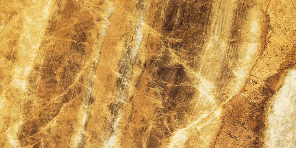
Gold Veined Stones: Subtle Glamour and Warmth

Gold-veined marbles and porcelains offer a contemporary expression of elegance that captures light with restraint, bringing warmth and sophistication without an overt shine. 

In neutral interiors, delicate gold veining adds tonal lift and tactile richness.

When integrated into vertical surfaces such as feature walls or fireplace surrounds, the reflective quality of the veins enhances natural light and creates depth. 

A polished finish intensifies the glow of metallic detailing, while a honed or satin surface mutes reflection for a more grounded effect.

ShowTile Design Advice: It pairs exceptionally well with warm whites, soft taupes, and brushed brass fixtures.  The combination feels cohesive yet elevated. For bold spaces, stronger veining with deep amber or bronze undertones becomes a visual anchor. 

Luce Golden Marble Polished 1200x2800 Backlit Tech

Creating Balanced Palettes with Veined Surfaces

The power of veining lies in contrast and proportion. Each element in a room should support the overall rhythm rather than compete for attention. 

To maintain visual harmony, combine bold veined surfaces with plain companions; for example, pair Calacatta porcelain tiles with solid white or warm grey tiles. Repeat tones subtly by echoing a soft beige vein from the floor in a nearby wall colour or benchtop. 

ShowTile Design Advice: Limit the number of dominant materials to three. One leading stone, one supporting texture, and one accent surface.

Room by Room Applications

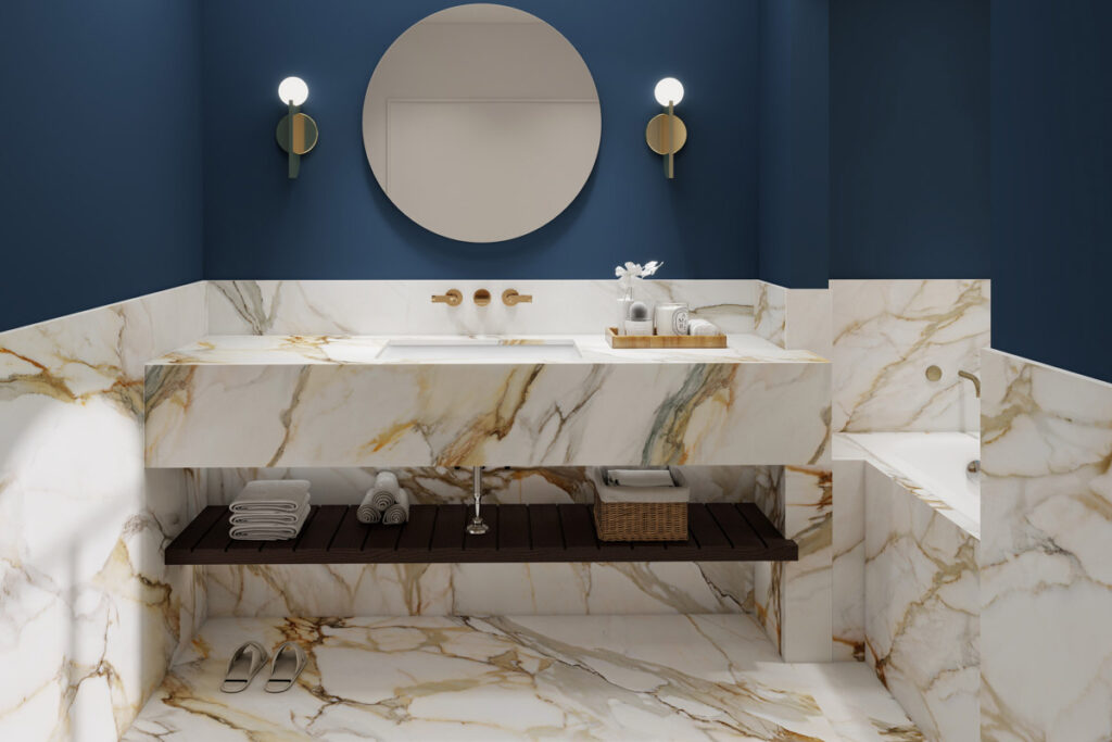
  • En-suites and Bathrooms

    White marble or marble-look tiles with gentle veining enhance the sense of cleanliness and spaciousness, creating a refined ambience. For contrast, a gold-veined porcelain slab can define a shower wall or vanity splashback, tying into brushed metal fixtures for unity.
  • Kitchens

    Onyx looks porcelain brings a luminous quality to benchtops and splashbacks. When used with matte cabinetry and neutral flooring, it becomes a focal point without dominating the room. Veined marble tiles across a kitchen island waterfall edge introduce continuity and sophistication.
  • Living Areas and Fireplaces

    Large-format marble or travertine look slabs can transform living spaces. Bookmatched veining behind a fireplace creates sculptural symmetry. Paired with soft-toned furniture, it delivers a balance of structure and calm.
  • Powder Rooms

    Smaller spaces invite bold expression. A dark marble with vivid gold veining can make a dramatic statement, especially when contrasted with soft lighting and minimal fittings.
  • Entryways and Hallways

    A continuous run of veined stone look tiles across the floor establishes direction from the moment of arrival. The pattern guides movement and defines proportion while setting the design language for the rest of the home.

The Show Tile Approach 

True luxury is quiet confidence.
It comes from restraint and deliberate pairing rather than abundance. A visual rhythm that connects colour, texture, and light.

Compositions that feel timeless, layered, and deeply personal. Designing with veining requires an understanding of architecture as composition. The goal is not to display the stone itself, but to integrate it into the broader story of the space. At Showtile, our marble, onyx, and gold-veined porcelain collections are curated for balance and cohesion.

Our expert designers have carefully selected each surface for its tonal accuracy, depth, and compatibility with contemporary palettes. These materials allow our customers to achieve timeless luxury while maintaining consistency across floors, walls, and joinery details.

To explore our collection or request architectural samples, contact the ShowTile team at info@showtile.com.au or call (02) 9709 5836.

Finishes & Textures That Elevate Luxury Interiors: Beyond Gloss and Matte

TL;DR:

Luxury interiors are defined by how finishes and textures interact with light, not just colour or form. Showtile explores honed, satin, matte, gloss, textured, and glazed tiles to create atmosphere, contrast, and tactile depth. Strategic combinations of surfaces, from polished to textured, stone-look to concrete-look, enhance flow, highlight architectural moments, and bring sophistication to bathrooms, kitchens, living areas, and outdoor zones. Every choice of finish and texture is curated to balance light, proportion, and spatial harmony.

Luxury interiors are defined by surface.

Not by colour alone, or by the form of a space, but by how light touches it. A room’s emotional tone is shaped by texture, finish, and the subtle transition between them.

At Showtile, we see finishes not as decorative layers but as instruments of atmosphere. A polished tile can expand a room through reflection. 

A honed surface can bring calmness. Textured finishes add the tactility and depth that turn minimal forms into moments of architecture.

This is where luxury design moves beyond the basic conversation of gloss versus matte. It becomes about how each surface performs in relation to light, proportion and material intent.

crazy pave tiles

The Role of Finish in Architectural Atmosphere

Finish determines how a surface speaks within a space. 

A single room can shift from bright and expansive to soft and intimate through a change in surface sheen.

Gloss finishes create a visual lift. Their reflective qualities enhance daylight and bring clarity to clean-lined interiors. When paired with darker tones or high ceilings, a gloss tile magnifies the architecture and frames light as a design element.

Matte finishes, by contrast, absorb illumination. They offer restraint, tonal consistency and a sense of stillness. In contemporary projects, matte tiles often anchor spaces that aim for comfort and visual calm.

Yet the most sophisticated interiors use multiple finishes together. 

A balance of reflection and absorption shapes a more natural spatial rhythm. The interplay between them creates flow.

marble look tiles with blue  walls and mirror

Honed and Satin Finishes

Between the extremes of gloss and matte lies an entire world of subtlety. Honed and satin finishes are increasingly favoured by architects seeking controlled light diffusion.

A honed surface softens light without dulling it. It reveals the natural variation of the material, especially in stone-look or terrazzo look tiles. The finish is tactile, grounded and timeless, suitable for spaces that value warmth over shine.

Satin finishes carry a gentle glow that feels effortless. They are often used to connect zones across open-plan interiors, bridging glossy feature walls and matte floors. This continuity helps maintain balance while avoiding visual monotony.

ShowTile style expertise: In a bathroom or master ensuite, a honed porcelain slab on the floor can pair beautifully with satin-finish wall tiles behind a freestanding bath. The combination creates visual contrast but keeps the mood quiet and cohesive.

Subway Satin Tile for Indoor Wall

Textured and Sculptural Surfaces

Luxury design thrives on dimension. 

Textured and sculptural tiles add movement where smooth surfaces might otherwise flatten. Fluted or ribbed tiles introduce rhythm. 

The repetition of form plays with light and shadow throughout the day. These details work exceptionally well in bathrooms, where vertical texture behind a vanity or shower wall transforms utility into architecture.

Sandblasted, chiselled and 3D-pressed finishes bring physical depth to feature walls and columns. Their tactile variation shifts perception of scale, making even compact rooms feel layered and refined.

Meanwhile, textured tiles can be used sparingly for emphasis. A single sculptural wall, balanced by surrounding matte surfaces, feels deliberate rather than decorative.

Natural materials have long influenced how texture is understood in architecture. Porcelain and ceramic manufacturing now reinterpret those qualities with precision.

Stone and Concrete Interpretations

Stone-look tiles with brushed or lightly cleaved finishes evoke the organic depth of limestone and travertine while maintaining the control of a manufactured product. These surfaces invite touch and soften geometry without losing elegance.

Concrete-look tiles add a modern rawness. In a honed or low-sheen finish, they offer subtle tonal variation that aligns with contemporary minimalism. Used across large-format slabs, they can visually elongate floors and unify adjoining rooms.

Showtile style expertise: Pairing concrete-look porcelain with a soft linen or oak palette creates quiet sophistication. The finish carries the texture of authenticity while delivering ease of maintenance.

stone look tiles

Glazed and Reflective Finishes

For interiors that rely on light as a sculptural element, glazed finishes remain unmatched.

In smaller rooms, glazed finishes can amplify light and make tight proportions feel generous. The key is moderation. A glazed tile used on one wall, balanced by matte or honed surfaces elsewhere, will read as luxurious rather than excessive.

High-gloss ceramic or glass tiles introduce luminosity and visual depth. They reflect their surroundings and shift tone as natural light moves through the day. When used strategically, such as within a kitchen splashback or bathroom feature, they add a jewel-like quality without overpowering the space.

Metallic or pearl glazes provide an additional layer of complexity. The subtle iridescence can mirror architectural metals or echo water reflections in spa-inspired bathrooms.

Creating Cohesion Through Contrast

Texture and finish gain strength through context. 

A purely matte interior may feel restrained but risks becoming flat. Gloss alone can appear cold. The most sophisticated compositions rely on the dialogue between contrasting surfaces.

Correct combinations guide movement and influence how light draws attention through a space. 

Combinations to consider:

  • A stone-look porcelain floor in honed finish paired with a ribbed ceramic wall tile in satin. The contrast in reflection creates visual hierarchy while maintaining harmony.
  • A textured wall in a natural travertine-look finish can be balanced with a polished porcelain benchtop. The relationship between soft and hard reflection adds refinement.
  • Designers often use finish transitions to frame architectural moments, such as at thresholds, niches, or built-in seating areas.

Room-by-Room Applications

Bathrooms and Ensuites

  • Soft matte or honed finishes provide grounding and safety when walking. 
  • Gloss and satin finishes enhance vertical surfaces. 
  • Fluted wall tiles are behind the vanity with smooth porcelain slabs elsewhere to give contrast and visual flow.

Kitchens and Splashbacks

  • Glazed finishes above the benchtop can bounce light into the work zone. 
  • Pair with a honed stone-look floor for warmth and practicality. 
  • Use the same tonal palette in both finishes rather than mixing extremes.

Living Areas

  • Textured wall cladding or ribbed large-format tiles can add architectural depth behind shelving or fireplaces. 
  • A low-sheen concrete-look tile on the floor offers a balance between durability and tactility.

Outdoor Zones

  • External tiles benefit from finishes that handle weathering while maintaining a visual connection to the interior palette. 
  • Choosing honed or brushed porcelain creates a natural extension of indoor areas. 
  • Consider slip-resistant surfaces in pool surrounds or patios while preserving the same tonal flow.

The Subtle Power of Grout and Light

Finishing alone never tells the full story. Joint spacing, grout tone, and lighting complete the visual effect.

Tonal grout lines allow finishes to blend and read as continuous. Contrasting grout can frame texture and reveal pattern.

Meanwhile, installing warm lighting enhances the softness of honed tiles, while cooler lighting sharpens glossy surfaces.

Showtile expertise: By viewing samples under both conditions, we can ensure the intended outcome. What appears subdued in the showroom may gleam under daylight.

Curation in Practice

Selecting finishes and textures for a project is an act of curation. It requires restraint and an understanding of spatial hierarchy.

At Showtile, we guide clients to compose layers that feel timeless rather than trendy. Each finish is selected for how it interacts with light, form, and the surrounding materials. 

Through this approach, texture becomes language, and finish becomes emotion.

Our collection includes honed and satin stone-look tiles, textured porcelain, fluted wall tiles, and refined glazed ceramics that are all curated for architectural integrity.

To explore our collection or request architectural samples, contact the Showtile team at sales@showtile.com.au or call (02) 9709 5836.